i don’t wanna dance
Sometimes I make little themed playlists on Apple Music for myself. I wanted to share one I had fun making:
https://music.apple.com/us/playlist/i-dont-wanna-dance/pl.u-pMyl4ljT4x6XkP
I hope you enjoy!
Sometimes I make little themed playlists on Apple Music for myself. I wanted to share one I had fun making:
https://music.apple.com/us/playlist/i-dont-wanna-dance/pl.u-pMyl4ljT4x6XkP
I hope you enjoy!
At the shelter, River’s first gesture was to offer me a tennis ball. He walked in — “Diego” on his nameplate — an escape artist and trouble maker. He’d tried families before us to no avail. But it immediately stood out to me that he just wanted to play, and it was clear right away that he was a playful boy at heart.

His free spirit had me convinced he would never be able to roam without a leash. Our first moments with him were on an Oregon beach, pinned between the craggy cliffs and the tide, waves crashing into the sand, finding any way we could to satisfy his desire to run out in the world without him running away. He ran in circles around us, overjoyed. Those moments of freedom are what he lived for.
River received so much of this love in his life, and he made it so easy to give. The second thing River did at the shelter, only after dropping the tennis ball, was roll over for belly rubs. I admire that he knew exactly what he liked and that he would ask for it without hesitation. He could never get enough.


He also knew exactly how to give love. When first I brought Miso here, even before they had met, I took solace in knowing that she would have a friend in River. He was the greatest big brother I could have asked for for her, and it’s clear to me that River lives on through the teachings he passed on to Miso – how to play nicely, even with those that are different than you. How to care for your space and protect those that you love. How to rest and draw boundaries when you need to.
River always intuited exactly what he needed to do, and he let his heart lead him. There’s this quote – “if you live each day as if it was your last, one day, you’ll most certainly be right.” River really did live that way, and we can all learn from the sense of presence that he carried.
He let his heart lead.
I always wondered why River ran away from his previous owners; how a dog whose beauty was only outmatched by his dorkiness came to end up in a shelter. A true rarity. I think he found his way to the shelter because he knew that the search for love continues, even in the face of great odds. I know he felt loved with us. I believe that dogs have very deep feelings, just the way we do. Just the way everybody does. And I think he knew there was someone out there that would love him just the way he way he was.
The love that River received in his life is exemplified by the love that surrounded him in his death. And that is what matters. No one wants to die. And yet death is the destination that we all share – no one has ever escaped it. Those waves on the Oregon beach — you see them rise as the water washes in toward the coast. They build and build until they crest, crashing into the beach before they’re gone.
but the water is still there.
the wave was just a state of being for the water.
so it returns to the ocean,
where it came from,
where it belongs.
River was a free spirit, and he chose to stick with us – what a privilege.
As we grew older together, he really did begin to unleash himself — he gained trust in us, and we gained trust in him. Right to the very end.
So it’s time for him to finally run free; you can only contain a free spirit so long. Now he returns to where he came from – where we all came from – and where we will all return, someday. He was a truly great and loving dog, and he lived a life of love, which I know he valued to no end.
Rest well, River. May you return to the water.

’Twas the night before Dub Dub, when all through the house, Not an iPad was stirring, not even with a mouse… – Stephen Hackett, 512 Pixels (link mine)
This is a continuation of the Harbingers series – an exploration of Apple’s advancements in Human-Computer Interaction and their influence on the computing industry. I’ve been working on Harbingers for over a year now, and I told myself I’d finish it before Apple announced their headset. Whoops! It stands alone, but builds on the ideas from Part 1.
The conceit of this series is that human-computer interaction (HCI) is the most interesting part of computing innovation. Its assertion is that the metaphors we use to define user interfaces have profound effects on the world. Its vehicle for this exploration is Apple’s contributions to HCI. And I’m publishing this the day before WWDC 2023 because I believe we are on the literal eve of one of these paradigm shifts – one that is 39 years in the making.
In Part 1 of the series, I traced the contours of the Finder’s development, which drew inspiration from three major sources:
None of these influences formed a complete product, which is why it took Apple to synthesize all three before any one of the ideas took off.
In general, a metaphor stands or falls based off of its explanatory power. In designing Lisa, Apple knew it was important to “find a central metaphor that’s so good that everything [aligned] to it. [After that,] design meetings [were] no longer necessary, [the device designed] itself”. “The metaphor,” they thought, “should be crisp and fun.” […] The GUI, spatial data management, and the desktop metaphor were three revolutionary advancements in human-computer interaction. The GUI thrust computers forward by creating an entirely new way computers and humans could talk to each other. Spatial data management leveraged the innate and evolved human ability to organize objects physically. And the desktop metaphor provided people with the scaffolding necessary to get started on a computer. – Harbingers (Part 1)
Iterations of the desktop metaphor have defined “real” computers ever since.
…to the surprise of many, users very quickly discarded any semblance of indirection [between the icons and the files themselves]. This icon is my file. My file is this icon. One is not a “representation of” or an “interface to” the other. – John Siracusa, About the Finder…
Harbingers began as an exploration of the infamous it’s-not-philosophical-but-it-really-is question posed in a 2018 iPad ad: “what’s a computer?” I became fixated on finding an answer when Dieter Bohn took a swing at it in April of that year, and have toyed with the philosophy of the question ever since.
At risk of spoiling things, this series is called “Harbingers” because I wanted to answer a question of my own: what’s with all the “stage” names in Apple’s marketing lately? Discussed at length in episode 350 of The Talk Show, Gruber elaborated on how inscrutable the names “Center Stage” and “Stage Manager” were, in juxtaposition to one another:
I do think it’s a I think it’s a bad name — not in and of itself — but it is a bad name alongside Center Stage because, in both cases, what the stage is, is entirely different! In Center Stage — the thing with the camera where you can move around in front of your iPad, or your studio display, and the camera pans because it’s ultra wide — the stage is your real world space where your sack of meat with teeth (that is, yourself) is operating. Your kitchen, your office, wherever the hell you are, it is the actual real world where you are in front of a camera. In Stage Manager, the stage is the screen, which could not be more opposite! It is, it is through the looking glass, but they’re calling both of them the stage, and it is very confusing, right?
Now, there’s one more question that’s been floating around as we’ve (perpetually) approached the release of an Apple mixed-reality headset: how the hell will this thing work? There have been no concrete answers to this question, despite a litany of details about forthcoming headset’s hardware – not unusual for an Apple release. Will the headset be gesture-controlled? Will it use a keyboard and mouse? Will it use your iPhone as a controller? What will the interface look like?
In investigating these ideas separately, they happened to collide in this series. When we ask, “how will the headset work?” or “why the mixed use of ‘Stage’ names?”, we’re really asking, “what’s a computer?”
Here’s my bet: the big announcement tomorrow won’t really be the headset. It will be a new paradigm for computing: the Studio metaphor.
When you zoom out and look at Apple’s cutting-edge technologies, the use of stage terminology feels deliberate. Of course, you’ve got Stage Manager and Center Stage. But theater terms show up everywhere in their technologies when you start looking: Focus1. Studio Display. Mac Studio. Spotlight Search. And that’s all before realizing that a “Studio metaphor” solves Gruber’s naming conundrum: if the world is the computer, the “Stage” is both the screen and the sack-of-meat-with-teeth real world space. If Stage Manager and Center Stage are designed for XR, of course the stage is both virtual and reality. It’s so elegant!
The proliferation of the GUI brought new a set of ideas about human-computer interaction when the Mac introduced the mouse. Multitouch broke through when it allowed for a sense of direct manipulation2 of the objects underneath the screen. So it makes sense that physical interaction will bring an entirely new set of design practices to the digital world. Stage Manager, in this view, is the beginning of an answer to these questions. It’s the dawn of a new computing paradigm. It’s a new way to get work done.
In fact, many of the problems Stage Manager is designed to solve are problems that become exacerbated in augmented reality. For example:
Just look at the set of criteria Craig Federighi gave TechCrunch as important facets of Stage Manager (emphasis mine):
“Building to M1 was critical as well,” says Federighi. “From the start, the iPad has always maintained this extremely high standard for responsiveness and interactivity. That directness of interaction in that every app can respond to every touch instantaneously, as if you are touching the real thing underneath the screen. And I think it’s hard sometimes for people to appreciate the technical constraints involved in achieving that.
“And as you add multiple apps into play, and large amounts of screen real estate, you have to make sure that any one of those apps can respond instantaneously to touch in a way that you don’t have that expectation with a desktop app. Indirect manipulation gives you some slack there, so it’s a different set of constraints.”
Stage Manager takes advantage of the more powerful GPU, faster I/O in virtual memory, faster storage and more RAM that the M1 chips brought to the table.
Notably, Apple backtracked on their policy that Stage Manager would only work on M1 iPads…with the caveat that non-M1 iPads would not support external display connectivity. Craig again:
“We also view Stage Manager as a total experience that involves external display connectivity. And the IO on the M1 supports connectivity that our previous iPads don’t, it can drive 4K, 5K, 6K displays, it can drive them at scaled resolutions. We can’t do that on other iPads.” […] “We really designed Stage Manager to take full advantage of the M1. If you look at the way the apps tilt and shadow and how they animate in and out. To do that at super high frame rates, across very large displays and multiple displays, requires the peak of graphics performance that no one else can deliver.
Wow, lots of talk about large, high-resolution, high-framerate displays. I wonder what that could be useful for?
“When you put all this together, we can’t deliver the full Stage Manager experience on any lesser system,” Federighi says. “I mean, we would love to make it available everywhere we can. But this is what it requires. This is the experience we’re going to carry into the future. We didn’t want to constrain our design to something lesser, we’re setting the benchmark for the future.”
So, in Apple’s eyes, Stage Manager is the window management system “for the future”, and I’d point out that while Federighi’s stated obsession with high resolution, high frame rate, and low latency interaction is important on the iPad, it’s doubly important in a MR environment: you don’t want your interactions with mixed reality to be pixelated, slow, or laggy. These facts only underly our previous convictions about Stage Manager; as far as user experience goes, beyond technical requirements, MR begs for a window management system that affords minimal distraction and minimal clean-up.
On top of all that, a studio metaphor would actually be an extension of the desktop metaphor: desktops can exist in studios! To me, it makes perfect sense that if you’re extending computing to a third dimension, then extending the metaphor to a third dimension makes a lot of sense.
But, hey. It’s 9:46PM on June 4, 2023 as I write this. We’re a mere twelve hours away from the WWDC23 keynote. If a Studio metaphor shows up tomorrow, it would be yet another step in Apple’s history of paradigm-shifting computing metaphors. I think it would be a lot of fun, too. If not, it was, at least, fun pondering while I had the chance. Tomorrow should be fun too.
Thanks for reading, and happy dubdub <3
It seems silly to state, but it is the job of every business to produce goods. And the thing that social media companies produce is users. They are a business that takes raw material — your time and attention – and turns it into a refined good: engagement. To illustrate:
What did news publications produce? Content – the news. They monopolized the supply side of the market and sold access to that supply to readers.
So, what do social media companies produce? It can’t be content; users and publications make the content. It’s not really technology. Almost all social media can be easily replicated by other companies1. One way to put it is that Big Social sells ad spots — that’s the industry-standard way of saying it, at least. Another way to put it is that Big Social sells your attention. You know that saying, “if you’re not paying for the product, you are the product?” That is what that saying means: Big Social’s only job is to produce you. They literally monopolize your attention and sell access to that supply to advertisers. You are being churned out of the sentient eyeball factory!!!
That is why, as an aggregator, when you run out of user growth, you die: you have failed to produce your product! You didn’t do your job! It’s over for you!
Look, I made you some content! Daddy made you your favorite, open wide.
Social platforms have a single euphemistic metric they maximize: engagement. Every platform competes in a perfect market for our attention, because it is the prerogative of Big Social to keep you hooked. They need you to spend the precious free minutes of your day on their platform, because without your eyeballs, they’ve got nothing to sell to advertisers. So if someone invents a more addictive cigarette, the old platforms can either copy them or risk irrelevance. That’s how you get a chum box. That’s how you get the CEO of Netflix saying that they “compete with sleep”.
I’ve long argued that TikTok represents the perfection of the phone-based social platform. Short-form video is highly engaging, and supercharging content discovery with a UI designed more for AI than humanity is exactly what data mining has promised to do for us (and for surveillance capitalists) since Facebook started serving us content in the News Feed. Short video + algorithmic feed = the perfect engagement mechanism. So Facebook…and YouTube…and Instagram…and Snapchat…and THE GUITAR TAB APP I USE have no choice but to design for the lowest common denominator: customized, hyper-targeted, user-generated, micro-video feeds. These CHUM2 feeds are the platonic ideal for engagement, maximized.
By the time TikTok showed up, its biggest competitors were already getting old. When it started stealing users and their attention, the apps simply copied it, as is industry custom, without hesitation or shame. Instagram, Snapchat, and Facebook were redesigned to look, feel, and in some cases recommend content more like TikTok’s. YouTube nagged creators to post “Shorts” and tried to get users to watch them. Now, the first thing Twitter users see is algorithmically scavenged content in a feed called “For You.” — John Herrman, Why Every App Now Feels Like TikTok, But Worse
You know how, given a crustacean, nature evolves a crab? That’s what is maximizing engagement does to social. At some point, you’ve got to wring value out of all that engagement your platform harnesses: given a closed, ad-funded social platform, nature evolves a CHUM feed.
Alright, then. Let’s start a list. It’s clear that:
BUT — in becoming counterfeit TikTok, these platforms have to sacrifice their soul. The platforms cease to be the medium they once were: Instagram is no longer a place to post photos with cute filters, it’s a CHUM feed. Facebook isn’t a place to visit your friend’s wall and post a message, it’s a CHUM feed. Snapchat isn’t a place to share ephemeral photo messages with friends, it’s a CHUM feed. Twitter, even, isn’t a place to post deranged stream-of-consciousness thoughts, it’s a CHUM feed.
The trade-off was clear: In exchange for more of a certain kind of engagement from your users, you make their experiences subtly worse, or at least less personal, under the guise of “personalization” (there is perhaps no more impersonal form of content than the second-tier “For You” recommendation). — John Herrman, Why Every App Now Feels Like TikTok, But Worse
This convergent evolution is the penultimate step in the demise of Big Social. They don’t realize it yet, but they’ve walked themselves into a corner that no capitalist wants to find themselves in: the commoditization corner. In general, businesses do not want to be commoditized because it means that their products or services are seen as interchangeable with those of their competitors. Say, for example, one CHUM feed for another. Being commoditized can also mean a loss of brand identity and differentiation, which can make it harder to build customer loyalty and maintain a competitive advantage. Commoditization is scary for companies because it means they are in the business of widget making, which is the business of low margins, efficiency, and sad CEOs.
So it’s all kind of dizzying trying to understand why social platforms would risk turning themselves into the same product as all of their competitors. To understand, you should know that nature evolves a crab given a crustacean, not any old sea creature. In the same way, nature evolves a CHUM feed given a certain type of company.
Remember, every social looks the same because every social’s incentive structure is the same: maximize engagement. But why does every company need to maximize engagement? Change the incentive, change the product! Right‽
Before the Web, traditional publishers were the dominant “aggregators” of content: they were successful businesses because they bundled the printing press with editorial with paper boys.
When the Web arrived, it lowered the barrier to both the publication and the distribution of content — this new technology commoditized the traditional publisher’s product. Anyone with an internet connection and a dream could have their own voice online. At first, this was ok for publishers. The Web was growing, and growing quickly. A rising tide lifted all the great boats.
But the Web’s greatest gift created a new problem: with the democratization of publishing came a lot of content. For new users of the Web, the problem was no longer obtaining good content, but knowing where to start and where to find it. This created an opportunity for new players to emerge — true Web-native companies were built solely to bundle and taxonomize the best content of the Web. These “curated aggregators” took the shape of companies like Yahoo, a massively valuable 90s-era company that made nothing but a list of links.
Through the 90s, this process would repeat itself: the web would grow, a company would find a new way to bundle all of the content together in one user interface, and that company would become the new king of the hill. Yahoo was successful because they put a huge portion of the web on one page. Google beat out Yahoo by aggregating all of the web into one text box. Amazon got big because it put all of the books in the world in one store.
This is the essence of Ben Thompson’s aggregation theory: the dominant players on the Web are often those that can aggregate and control access to a large number of users, suppliers, or both. This allows them to create value by leveraging network effects and economies of scale.
And what came after Yahoo and Google? Perfect aggregators. Social networks. Content platforms. Facebook and YouTube, Twitter and TikTok. Aggregators so complete in their commoditization of content that they placed the New York Times’ articles right next to your decrepit Facebook “happy birthday” posts. These 2000s-era Web companies were living the dream of the 90s: get big and profit. Every last one used the same playbook, the aggregator’s playbook, and as a result, every last one ended up with the same incentive structure: grow engagement.
/history lesson
So, an updated list:
If you give a mouse a cookie…
Here’s the thing about aggregators: they are using one of the most successful business models ever invented. You can’t really blame them3. But, in general, there are only two options to keep growth going.
Plan A is the best option: grow your user base. Remember, this is the playbook of aggregators: provide a good service, which attracts people to your service, which attracts suppliers to your service, and you’ve suddenly got a virtuous cycle going.
But, inevitably, there comes a point where user growth stops. Maybe you run out of people interested in microblogging. Maybe you run out of humans to make a Facebook account. Maybe the next generation stops coming to your platform. It doesn’t matter how, really. User growth always stops.
To keep growing your revenue, you’ve always got Plan B: get your users to use your app more! This option is still pretty good. Sure, you’re making your users more dependent on your app. You might get some flack for making your service too addictive, but it’s a price you’re willing to pay to keep your investors and publishers happy. After all, the more time your users spend in your walled garden, the more you can advertise to them. This usually starts out as a shift from a chronological feed to an algorithmic one.
But, wait. We know this story – this plan suffers from the carcinization problem. If there’s another app out there that does a better job taking up your users’ attention, they’ll just leave you in the dust. In that case, you’ve got no choice other than to steal ideas from that competitor, subsidize content to fill your app’s new feature, and then pray your user base doesn’t abandon you. This is, in every way, a corruption of the medium you established when you started your social network. It’s a step towards commoditizing your service. But it’s a price you’ll have to pay to keep growing.
But there must be a Plan C? Maybe charge users for access to your app? Hell no. Maybe start charging publishers for access to your existing customer base? In the short term, it solves your revenue problem, but that doesn’t solve your growth problem. In the past, you might solve your growth problem by buying another social network popular with the next generation of users. But that won’t happen in today’s regulatory environment. I guess Plan C is to pray that Congress bans TikTok to buy you some time.
This impossible set of choices is what I call the aggregator’s paradox. When you run out of user growth, your march toward death is inevitable.
Aggregators gonna aggregate. But given sufficient technological innovation, aggregators also gonna get aggregated. What happened Yahoo — and what happened to traditional publishers before them – will someday happen to Big Social. I believe that we are in the midst of that shift now, as exemplified by whatever it is that’s happening on Twitter.
After the dot-com bubble kicked off the new millennium, people stopped believing in the promise of the Web. But Google and Amazon – and memories of Netscape – carried the torch from “Web 1.0” into a new era. Here, with a proven business model and an open Web, social media giants like Facebook, Twitter, and YouTube emerged. Suddenly, it wasn’t enough to have your own website - you had to be part of a larger social graph. Facebook, Twitter, and their ilk became the new gatekeepers, controlling who saw what and when. This has been our “Web 2.0” experience, defined by user-generated content, algorithmic feeds, and the creation, abuse, and destruction of social graphs.
A final list:
So now, a new hope. The decentralization movement represents an opportunity to commoditize the key remaining asset of Big Social: the social graph. Our eyeballs. In a way, they’ve already given up on social graphs…it’s too late, they’re all TikTok now. Big Social has literally taken social connection and mined it for all it’s worth. And that’s ok! We’ll just know that big tech aggregators are always ad platforms, first and foremost. The Internet was always bound to have an ecosystem of billboards, I guess.
Let’s take back our connection to others – distributed social networks like Mastodon and protocols like ActivityPub enable new forms of peer-to-peer communication and collaboration where we own our relationships online. We’ve got the chance to build our social graphs into the structure of the Internet itself, which may sound radical, but feels better than building them into the structure of private aggregators, who will always — always — abuse and abandon them.
Some have opined that web 3 is all about crypto or “the metaverse” — sure, maybe4! I take a more conservative stance: web 3 will begin with decentralized social. The social web. Maybe more decentralization will follow; as has always been the case with the Web, the story is all about commoditization and aggregation. This time, though, social media is legacy media. And it’s honestly their turn to be commoditized.
Now, we can build our social graph without the need for centralized intermediaries, the same way the Web built structures for publishing and distribution without the need for centralized intermediaries. We’ve got the power to do that! But I forget, does anyone know if the Web was successful?
e.g. Stories.↩︎
🫡 I might be angry at myself for this terrible hyphen-ridden backronym if I wasn’t so angry about the state of social.↩︎
You can.↩︎
If you know someone who can convince me that crypto is an actual substitute for money, @ me – @austinha@mastodon.social.↩︎
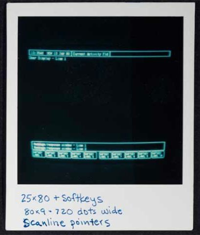
Steve Jobs always kind of hated the Finder. In fact, in his last keynote ever, he took a characteristic beat to pick apart the thing he considered his son: “a lot of us have been working for ten years to get rid of the file system”, he said. “When you try to teach somebody how to use a Mac, the easiest of all computers to use, everything’s going fine until you hit the file system!” His critique of the Finder – the face of the Mac — marked the end of his decades-long voyage with turbulent ideas about what a graphical user interface could – and should — be.
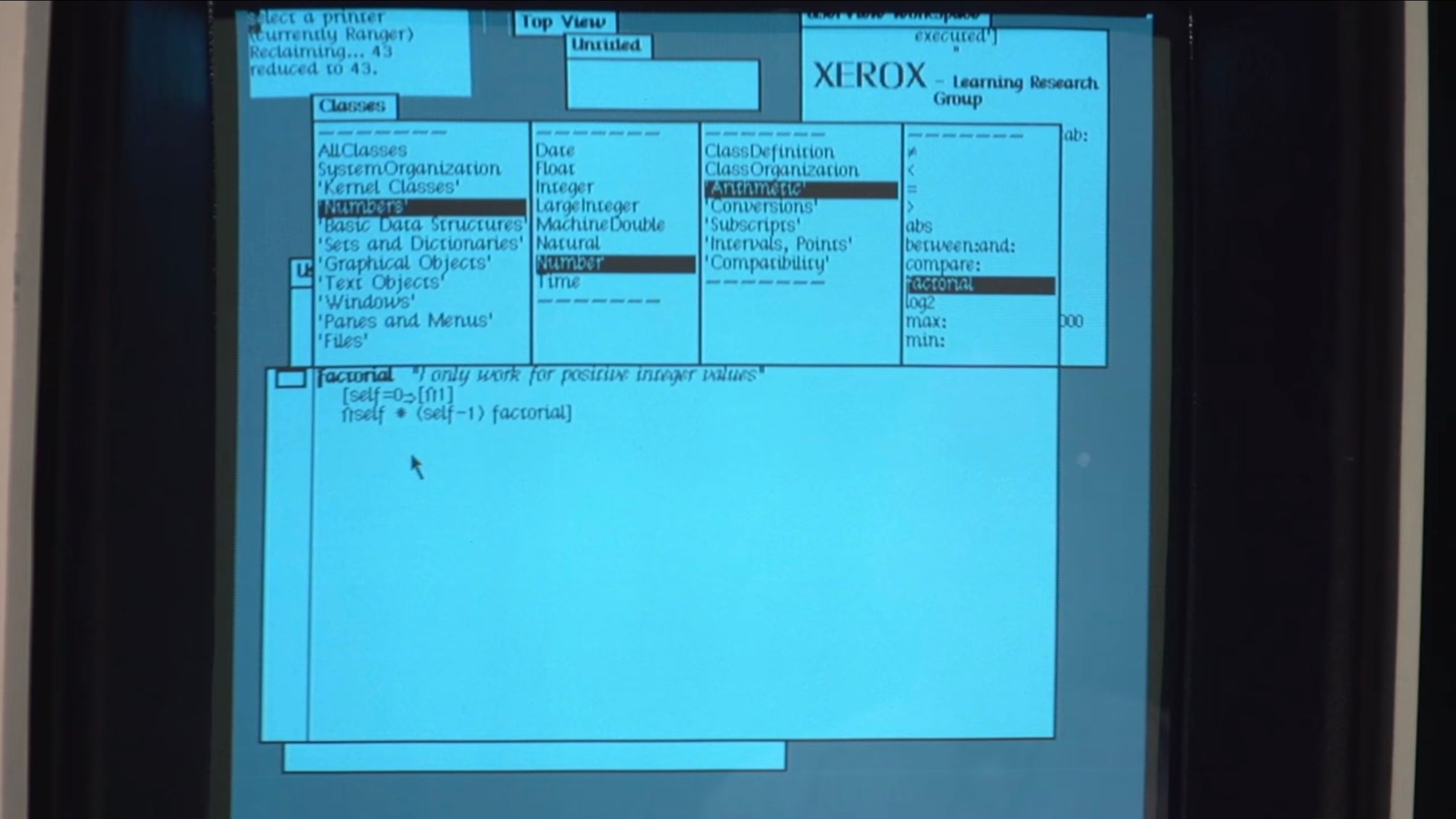
If Jobs’ voyage with the GUI ended in 2011, his file system odyssey began in 1979. In what has been called computing’s “Prometheus myth”, Jobs visited Xerox PARC with a small team from Apple, where they received a demo of Smalltalk running on an experimental computer called the “Alto”. There, Jobs saw the graphical user interface working on a personal1 computer for the very first time. “Within ten minutes”, he would recall, “it was obvious to [him] that all computers would work like this”.
As the story goes, the team would then steal the graphical user interface from PARC, run with it, and turn it into the Mac. They’d stolen the GUI from the gods and given it to the people.
But as with any great myth, the version that gets told is much cuter than what actually happened. And as with anything that…actually happened…the storylines of Xerox PARC, Steve Jobs, and the Mac weave and wander their way into a tapestry that is more fascinating than any cute myth can capture. You see, the truth of the story lies in the fact that the GUI’s debut was not on the Mac, but the Lisa. And the story goes even further back: at the start of the project, the Lisa was not a machine with a GUI, but was one with a command line.
When the Lisa project began in 1978, it was going to be a successor to the Apple II. It was aimed squarely at professionals who needed a word processor. So, when the Lisa team entered PARC in late 1979, the machine was supposed to be just that: a command-line computer with green text staring back at you, beckoning ominously for a command.
The Lisa team’s goal was to have the computer make accomodations for the “average” user, who would just want to process text and almost certainly wouldn’t want to memorize commands. Before PARC, they’d do this by listing the commands on the bottom of the screen in a menu of options to choose from, allowing the user to select commands using special function keys on their keyboard. By the time the Lisa team left PARC, though, the computer was set to become something else entirely.
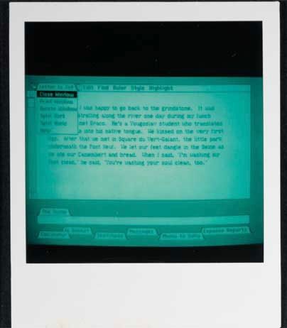
After the visit, Bill Atkinson swiftly led the charge to create a user interface featuring windows, icons, menus, and pointers inspired by the team’s goal to make the Lisa accessible, and of course, by they work they’d seen at PARC. As he began, the Lisa spec was rewritten and the first iterations of Apple’s graphical user interface began looking a lot like the demo they’d seen on the Alto.
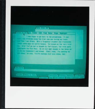
The rest of 1980 featured rapid iteration on the core ideas they’d seen in Smalltalk. Mouse-based text editing, non-modal commands, scroll bars, title bars, clipboards, I-beam cursors, moveable and minimized windows, double click, and pull-down menus were all present by the end of the year. At this point, the GUI really did resemble a more refined version of Smalltalk.

But just as the Lisa was getting some wind in its sails, Jobs was forced to walk the plank. Forced off the team, he began to hunt for new projects to latch on to throughout the company. After seeing a prototype Mac, he decided to jump aboard. At this point, the Mac team had quietly been plugging away at their skunkworks project for a couple years under the leadership of “Uncle” Jef Raskin. But the details were still pretty fuzzy by the end of ’80. While the Lisa team had already finalized their direction and approach by the start of 1981, the Mac’s direction, under the leadership of Jobs, was about to change drastically.
It’s safe to say that Jobs, with his distinguishing mix of passion and vengeance, was ready to exact revenge on the Lisa and his former team. The Lisa project is where Jobs had fallen in love with the GUI, and after being separated from his baby, it became his goal to turn the Mac project into a computer that would compete with the Lisa to bring the GUI to the people.
In many regards, this goal made the Mac team the perfect place for Jobs to land. Uncle Raskin’s original vision for the Mac was an “easy to use, low cost, high volume appliance” computer. But eventually, as Jobs took a more and more central role on the team, Raskin began to push back: he “was dead set against the mouse…preferring dedicated meta-keys to do the pointing. He became increasingly alienated from the team”, eventually resulting in Jobs leading a mutiny on the project so that he could take the helm. With Raskin out, Jobs took control of the skunkworks Mac group.
Throughout ’81, the Lisa continued to calcify. Key applications were being written on the GUI that, by now, had a solid foundation. Back on the Mac, work had begun on its iconic industrial design, and the graphics foundations of the device were finally being written. By the middle of the year, collaboration between the Mac and Lisa groups was steady. The Lisa’s UI really solidified, which the Mac group continued to draw from, while Atkinson’s fundamental Lisa graphics component, QuickDraw, was ported to the Mac. At this point, the Mac was starting to get recognized as a real project throughout the company: it was thought of as a “Lisa that was priced like an Apple II”.
It’s at this point that I want to tell you why I’m recounting this story. Many others have told it before. But what’s often left implicit is what the Lisa team didn’t see at PARC. Yes, Smalltalk was decades ahead of its time. Yes, it single-handedly spearheaded massively influential technologies that are still prominent to this day. But Smalltalk didn’t have a file manager.
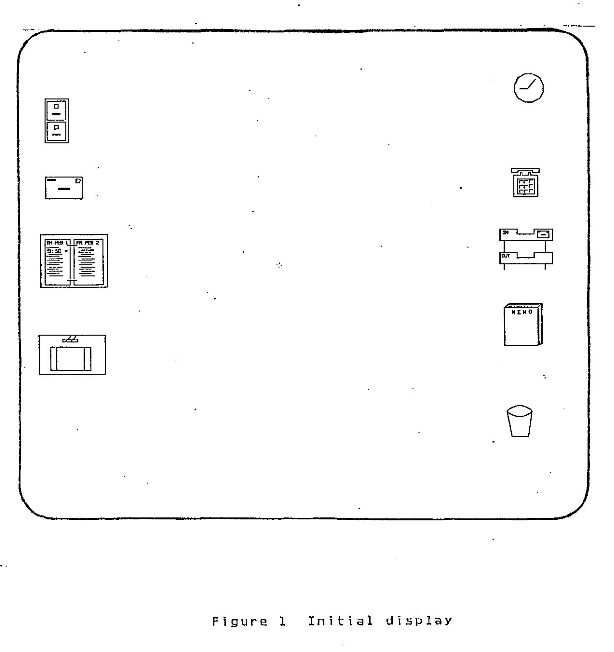
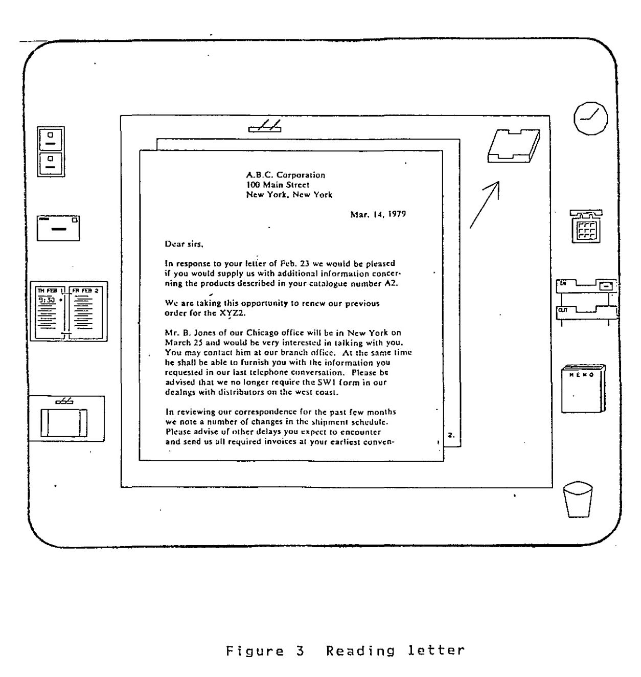
Remember, the GUI began on the Lisa and the Lisa began as a word processor. Its aim at the office meant that it was going to be made to do office things, namely create and manage documents. (What’s more office-y than managing documents‽) So, at the start of ’82, the Lisa’s file manager – called “the Filer” — became an important point of frustration for the Lisa team.
Dan Smith and Frank Ludolph were working on the Lisa Filer, the key application that managed files and launched other applications. It was beginning to come together, but Dan was still unsatisfied with the current design.
The Filer was based on a dialog window that prompted the user to select a document from a list, and then select an action like “Open”, “Copy” or “Discard”, and then answer more questions, depending on the selected action. There was so much prompting that it became known as the “Twenty Questions Filer”. Dan thought that it wasn’t easy or enjoyable to use, but there just wasn’t enough time left in the schedule for further experimentation, so they were pretty much stuck with it. — Andy Hertzfeld, Rosing’s Rascals
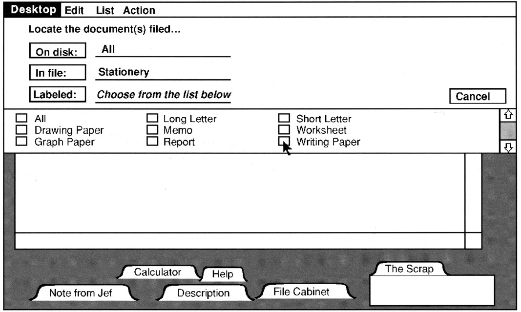
The idea of a simple, filter- and directory-based filing system was drawn from what the team had seen at PARC. It’s what was normal at the time, being directly analagous to the file management practices that pervaded text-based interfaces throughout most of the prior history of computing. Put simply, you’d work to find the file you wanted by moving through lists of files and directories, forcing the user to abstractly visualize entire trees of information that might exist on their computer. So, while the Twenty Questions Filer wasn’t great, it was par for the course and it would have to do.
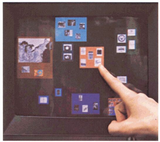
The Mac team was also experimenting with file managers at the time. Bruce Horn had recently joined the Mac team — from Xerox PARC, in fact – and was working with Andy Hertzfeld on the Mac’s version of the Filer, in this case dubbed “the Finder”. By February 1982, Horn and Hertzfeld had thrown together what they called the “Micro-Finder”.

Bruce came up with the idea of representing files as small tabs superimposed on an image of a floppy disk. He wrote a prototype that he called “the micro-finder”, which is pictured above. I started helping him implement various parts of it, and pretty soon it was actually useful. You could drag the file tabs to position them, and click on the large buttons on the right to launch programs or rename and delete files. — Andy Hertzfeld, Busy Being Born, Part 2
While it looked nothing like what the Finder would become, it did bring several innovations to a truly graphical file manager: instead of requiring the user to visualize abstract directory “trees”, it allowed them to see files, go to them, and move them around the screen with drag-and-drop.
Back on the Lisa team, Dan Smith couldn’t take the Twenty Questions Filer anymore. He brought his woes to Atkinson, who “suggested that they meet that evening at his home in Los Gatos for a brain-storming session to see if they could come up with a better design, even though it was probably too late to use it for the initial release.” Atkinson had recently seen the Micro-Finder, along with a second version that used icons, which the Los Gatos crew used as a starting point to discuss a new direction for the Filer. He also took inspiration from “an interesting prototype that he saw at M.I.T. called Dataland, where data objects could be spatially positioned over a large area.”
Dataland was the result of work from MIT’s Speech Interface Group, funded by DARPA. It was a research effort framed through the combination of two distinct lenses:
First, the group aimed to create a computer interface that used a “memory palace” to augment human performance and recall. Also known as the “Simonides Effect”, the technique asks an individual to take whatever is being memorized and visualize it in a familiar location — exploiting humanity’s evolved ability to recall information spatially — to enhance their memory. It has historically been used to recall things like speeches or poetry.
Second, they hoped to create a semi-infinite virtual world “open to user definition in the unconstrained sense of Ivan Sutherland’s characterization of a computer display as ‘a window on Alice’s Wonderland’”. In other words, they hoped to acknowledge that the physically limited size of a computer’s display does not necessarily limit the implied size of content being displayed; unlike a physical page, a computer display is a magical and flexible window into the world of content inside the computer.
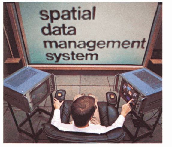
Combining these spatial concepts resulted in the “spatial data-management system” (SDMS), whose goal was to help a user “[access] a data item by going to where it is rather than referencing it by name” (emphasis mine). This approach was directly opposed to the common practice of asking users to fetch documents by name, which required abstract visualization of file “paths” and directory “hierarchies.”
“It is precisely the insight about how we tend to retrieve items from desk tops, from files and bookshelves, even from erased blackboards, that lies at the heart of the spatial data management concept”, they said, “we find items on the basis of a more or less definite sense of their location in a familiar space, which space may be actually present or remembered. This well-evolved human ability to organize information spatially remains essentially untapped in the realm of computer-based information handling.”
The affordances the Speech Interface Group created in their SDMS toward this end were numerous and, looking back, quite astounding. In their 1979 paper on SDMS, the Speech Interface Group described the details of Dataland in three separate sections, first describing “the setting,” then going on to break down how users “find” data and subsequently “peruse” data.
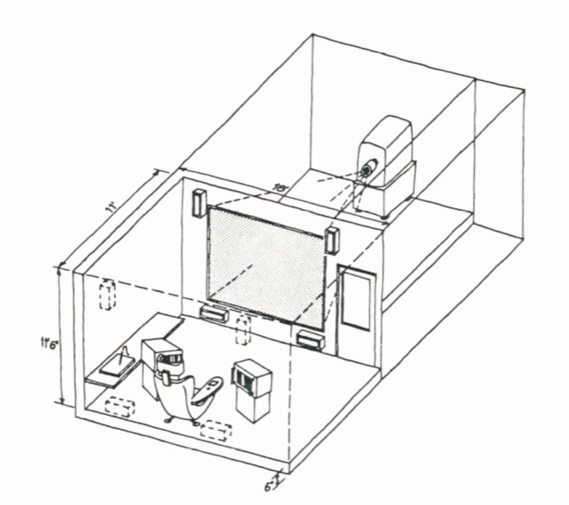
As far as setting goes, a user would sit at the center of multiple screens, some of which were touch-sensitive, and then would “point to data or [would] input gestures indicating actions to be taken” on a graphical user interface.
If your jaw hasn’t hit the floor yet, this was three years before the Apple Xerox PARC visit. It was nineteen hundred and seventy fucking six and they were incorporating an optional “ten-inch-square data tablet, with stylus,” and “a small microphone mounted at its top edge to allow voice input”, all topped off with an “octaphonic sound” system enabling spatial audio (!!!). But we’re getting ahead of ourselves.
To find data, users needed “commodious ‘virtual’ space” as well as “a way of getting around in that space quickly and easily.” The Speech Interface Group’s SDMS was implemented using two distinct views of Dataland: first, a view “continuously visible to the user in its entirety in an ‘aerial,’ top-down view displayed on one of the monitors,” called the “world view monitor”, and second, “simultaneously, a small subsector…displayed on the ten-foot diagonal screen to the user’s front, vastly enlarged and with appreciable gain in detail.”
It takes all I’ve got to stop talking about Dataland, but I’ll cut it off here because it’s at this point that we can see its categorical influence on the Filer. Even beyond the use of the SMDS’s philosophical basis, Dataland’s simultaneous world view and magnified view were actually present in the earliest mockups of the Icon Filer, which was a split-pane view with the top pane depicting the “world view” and an “exploded (detail) view” in the bottom one.
The split-pane concept was eventually scrapped, but it’s clear that this foundation is what gave birth to the Lisa’s graphical approach to file management. The Filer strictly adhered to what the SDMS achieved by allowing users to, as the Speech Interface Group defined, “[access] a data item by going to where it is”.
At this point, most of the Lisa team’s approach was set — the Filer and Finder had taken lessons from Dataland, and the window manager mimicked features from from Smalltalk. Still, something was missing. Remember, the Lisa was supposed to be a computer aimed at popularizing the GUI by growing the market to include, as Apple PR noted, “more than 30 million americans – and millions more abroad — [who] work in offices. Executives and managers in the accounting, marketing, financial, engineering, and planning professions” were the prime targets of the “computing market of the future” (emphasis mine).
To appeal to this market, the interface needed to be familiar to someone unfamiliar with computers: windows and spatial filing are great, but if you don’t know where to start, you’ll probably never touch a computer again. To achieve this, the Filer team turned to IBM.
Back in 1980, a year after Dataland, IBM published a paper called “Pictureworld”, describing a system with a graphical user interface aimed achieving many of the same goals that were articulared for the Lisa:
The list goes on and continues to be remarkably similar. IBM’s solution to satisfy these requirements? Create a user interface that “[provides] much more competence in modeling the users’ task environment and needs than has previously been attempted”. For an office worker, the user’s “task environment” was the office itself.
In using iconic representations of familiar office objects (on its display) as a control interface,” they said, “the Pictureworld concept achieves familiarity, naturalness, self-prompting, and (plausibly) minimal cognitive interference with the primary task.”
The design centered around workflows that an office worker might want to achieve. On startup, Pictureworld would greet users with a diorama of an office setup, complete with a filing cabinet, inbox/outbox, memo pad, desktop, and more.

The user might then open their inbox to review and take incoming documents (from some disk or network) to file them away or to do something with them by placing the documents on their desk, which sat on the side of the screen along with the rest of the office paraphernalia.
From there, the workflow would continue, prompting the user along a series of decisions about what they could do with their documents.
It’s clear that IBM’s envisioned implementation was a far cry from where the Lisa ended up, but the metaphor they suggested was powerful. By leveraging office workers’ existing knowledge of the office (and workflows that happen inside the office), a computer could simulate common office practices by conjuring them up in a graphical interface, thereby reducing the amount of learning necessary for a novice.
In general, a metaphor stands or falls based off of its explanatory power. In designing Lisa, Apple knew it was important to “find a central metaphor that’s so good that everything [aligned] to it. [After that,] design meetings [were] no longer necessary, [the device designed] itself”. “The metaphor,” they thought, ”should be crisp and fun.”
So the Lisa team took the desktop metaphor, combined it with a few other insanely great ideas for user interface, and created the computing paradigm that would reinvent the personal computer for the remainder of the millennia, and, arguably, to this day.
The GUI, spatial data management, and the desktop metaphor were three revolutionary advancements in human-computer interaction. The GUI thrust computers forward by creating an entirely new way computers and humans could talk to each other. Spatial data management leveraged the innate and evolved human ability to organize objects physically. And the desktop metaphor provided people with the scaffolding necessary to get started on a computer.
When the Lisa team combined these ideas with a little bit of polish, they formed something greater than the sum of its parts. They’d created the desktop paradigm by allowing users to directly manipulate the content they saw on their screen, picking up and putting down files to organize them just like you’d do in the real world. Even the simplicity of the single-button mouse lent itself to this physical facsimile: clicking a button and and dragging a mouse is literally grasping an object and moving it somewhere else, a perfect analog to the drag-and-drop nature of the Filer.
Their graphical user interface became the only system at the time to support a desktop metaphor with truly spatial filing2, an innovation that quickly became a cornerstone of Apple’s graphical interface; the Lisa became the computer that “works the way you work”, as an early ad would tout.
Soon after the Los Gatos sprint, Bill Atkinson shared the innovation back to the Mac group, who would immediately adopt the spatial desktop approach for the Finder.
The Lisa went on sale in January 1983 as Apple’s flagship product, with Steve’s Mac team following hot on its heels. Bruce Horn and Steve Capps ended up completing the Mac’s Finder, based on the Lisa’s pioneering interface, just before release in January 1984. With that, the Finder was born. And so was the Mac.
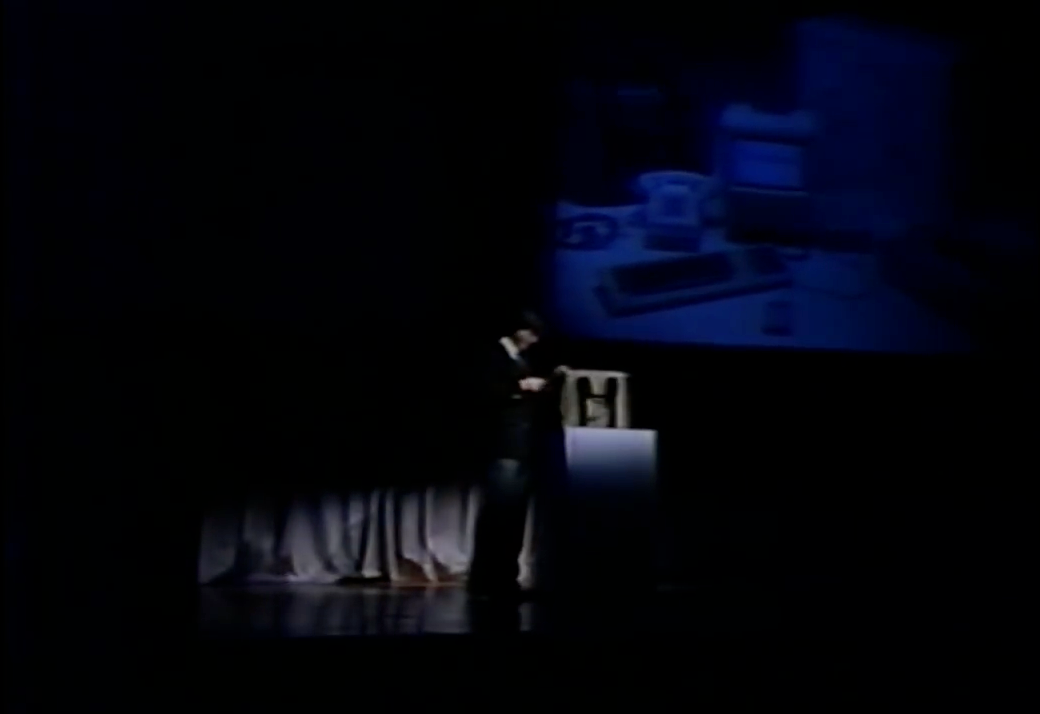
“Hello. I’m Macintosh.” The computer’s voice vibrated, “it sure is great to get out of that bag.”
“Unaccustomed as I am to speaking, I’d like to share with you a maxim I thought of the first time I met with an IBM mainframe: NEVER TRUST A COMPUTER YOU CAN’T LIFT!”
The crowd erupted.
“Obviously, I can talk, but right now I’d like to sit back and listen. So, it is with considerable pride that I introduce a man who’s been like a father to me… STEVE JOBS.”
You could see the delight beaming in Jobs’ smile as the crowd broke out in pandemonium.
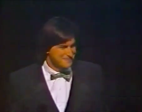
“The uh…” Jobs began as the crowd finally quieted down, “team that developed Macintosh is sitting up here in the first five rows, and they must feel awfully good right now.”
They’d done it. They’d shipped.
Later on in the presentation, Jobs showered the Lisa faint praise: “we introduced Lisa a year ago, and it clearly captured the imagination and set the technical direction of the industry”, he said. After a pause, he continued with a smile: “it didn’t capture as many desks as we wanted to.”
The Lisa had beaten the Mac to market as a GUI-driven computer, but it had come in at a hefty price. The Mac, on the other hand, was going to be priced to be sold in massive quantities.
“The telephone was the first — and only, really — desktop appliance,” Jobs continued, “and we think the Macintosh can become the second desktop appliance for…tens of millions of people. Because of the 235 [million] people in America, only a fraction know how to use a computer! Macintosh is for the rest of us.”
In the effort to make the Mac the second desktop appliance, Jobs laid out three keys components for success. It needed:
Just like uncle Raskin had envisioned years before. After all, Jobs had never lost sight of the original vision for the Mac.
To be really cheap was easy: the Apple II was cheap enough to become the first commercial personal computer. It kept Apple afloat for years by being an accessible option for hobbyists and small businesses while they looked for another hit.
To be really useful was harder: the success of the Apple II was driven by the fact that it was a platform for developers, who extended the computer’s function with their software. In 1979, Visicalc (spreadsheet software) became the first ever killer app, expanding the market for Apple II computers from hobbyists to businesses. In short, Visicalc became the first software that was so compelling that it alone sold Apple computers. Nonetheless, in opposition to the Lisa, the Mac tried to capture the spirit of extensibility: it was designed to support third party software, while the Lisa was not.
To be really easy to use was even harder than that: this was the reason that alphabet soup of PARC, MIT, and IBM were combined in Apple’s intensive design process for the Lisa’s, and then the Mac’s, graphical user interface. The solution Apple came to, in a unifying model for the user, was the desktop metaphor as manifest in the Finder, which “would be the ‘face’ of the Macintosh.” Of course, they were successful in that regard: the Finder was “the single most important and influential application in the Mac OS user experience.”
It has been said that “the interface is the computer”, meaning that the average user makes no distinction between the way he interacts with the computer and the reality of the computer’s internal operation. If the interface is hard to use, the computer is hard to use, and so on. The interface is the computer. – John Siracusa, About the Finder…
The Finder was the Mac’s interface, and the Finder was easy to use, so the Mac was easy to use. It’s really as simple as that. The Finder is what made the Mac a success. The Finder is what popularized the GUI.
So there you have it, your little myth all wrapped up in a nice and tidy bow. But I promised you a mess, and if you’ve made it this far, I hope you’re expecting it. Remember, the Finder wasn’t really an innovation from the Mac team. Instead, the spatial desktop metaphor came from the work on the the Lisa, and it fundamentally reflected that heritage. Sure, it was a quantum leap in ease-of-use. Sure, it popularized the GUI. But the Finder’s audience was ultimately the office worker, not the average person. The desktop metaphor centered documents in the user’s workflow — that’s why the Finder was the “face” of the Mac; it was what greeted you every time you turned on your computer. But while a document-centered workflow is great for office workers, who are constantly dealing with documents, it isn’t the ultimate computing-information-communication end-all. Most people, after all, spend very little time tending to their spatial desktop. Your desktop, like mine, might be littered with miscellaneous screenshots and projects and more. Sometimes the mess can really make you feel like a janitor.
You don’t know about real loss ’cause it only occurs when you’ve loved something more than you love yourself.
The party didn’t last long. While the Mac initially became “the first $2,500 impulse item”, selling 50,000 units in 74 days, it failed to live up to the very first of Jobs’ three goals for a desktop appliance: it wasn’t very useful. Despite the Mac team’s efforts to bring developers to the platform, devs just didn’t show up. The team had anticipated that it would be an uphill battle, since the GUI required a completely new programming paradigm for developers, but several other obstacles (including the fact that, at first, you had to use a Lisa to program for a Mac) prevented the next killer app from taking off on the Mac.
So just as the Lisa and her little brother came into the world, their father was forced away: after a strong start, sales began to falter, and Jobs was — infamously — forced out of Apple. Eventually, the Mac found its niche by spearheading the desktop publishing industry, and by 1989, it would sell in the millions, just as Jobs had prophesized. But it was already too late.
To be continued…
My first iPad was a first-gen mini — it was my high school foray into the world of paperless note-taking. Despite its small screen, I loved the size: it was unobtrusive when compared to the laptops others brought to school, and when paired with a stylus1, it felt like carrying a pocket notebook with infinite pages from class to class. It was the perfect portable to-do list, the most versatile portable gaming device for lunchtime, and, on top of all that, my pocket clapperboard for film production in Video III2. I used the hell out of that device up until I bought myself an iPad Pro to continue the paperless journey in college. Ever since, what I’ve missed the most is the way the mini just felt so easy to take anywhere without thinking twice.
So when the sixth-generation iPad mini was announced last year, I was instantly drawn to its potential. It was cute, it was pretty powerful, and I could think of about a hundred small use cases for it in my life. Dieter Bohn said it best in his review for the Verge (emphasis mine):
I dearly love the iPad Mini and have gone so far as to replace my iPad Pro with one. If anybody asked me if they should do the same I would be loathe to say yes.
Instead, I would respond with another question: do you know exactly why you want to have a smaller iPad instead of a big phone or a full-size iPad? Because the iPad Mini is not very good at the things those are good at, and it’s only really better than those things in a few specific ways. I just happen to care a lot about one of them.
And that’s the thing about the iPad mini: it doesn’t make a lot of logical sense as far as value goes in Apple’s current iPad lineup. Its tiny screen simply isn’t optimized for anything other than fitting in the mini’s enticing form factor; and while its specs are great, it is no more powerful than what you’d get in, say, an iPad Air for a similar price. But its appeal to Dieter and I captures the essence — and the weirdness - of the iPad mini. It’s a device of specificity.
In fact, when the new mini was announced, Apple really leaned into the weirdness. Tim Cook’s first words about the mini were basically, “this iPad is weird, and that’s why it’s great”:
There’s simply no other device like iPad mini. It gives users all the power of iPad in its most portable form, which makes it indispensable for a wide range of uses like when it’s secured to the leg of a pilot in flight, or pulled from a doctor’s lab coat to care for patients in the ER. iPad mini is in a class of its own. – Tim Cook, September 14, 2021 Apple Event
By highlighting pilots and doctors as iPad mini users, Cook centered the new mini’s introduction on two hyper-specific groups that know exactly why they’d want a smaller iPad instead of a big phone or full-size iPad; two groups that know exactly how the size of the mini fits into their workflow. But as Cook spoke, I felt confused about the product. “The mini is the lowest-end iPad, right?” I thought, “isn’t it the one that Apple makes to hit price point?” The questions rattled through my head as I grew even more confused when the price was revealed to be $4993. But my cognitive dissonance eventually gave way to a new understanding of Apple’s newfound clarity on just who the iPad mini is for: professionals. It’s a strong take, I know, and many have commented that the mini is really an “iPad Air mini,” which, technologically, I agree with. But, again, the iPad mini’s weirdness — its movement toward the iPad’s new design language combined with its small size and ability to run full iPadOS — results in a form that really can wriggle its way into those “pro” workflows quite well, including those of pilots and doctors.
As we head into Apple’s “Far out” iPhone event this week, it’s been widely reported that the iPhone mini is headed the way of the beloved Netflix show in its second season. Here’s what I’ll say for its exit interview: I wish Apple made an iPhone mini that was more like the iPad mini – and by that, I mean weird and specific. Sure, Apple almost literally defines mass-market electronics, and maybe for a company like that, there’s not a lot of room for weird; it’s just not profitable enough. They tried to make a run at it and it just didn’t work. But I think that reconsidering the mini’s role in the iPhone lineup would unlock new potential for the littlest iPhone there is.
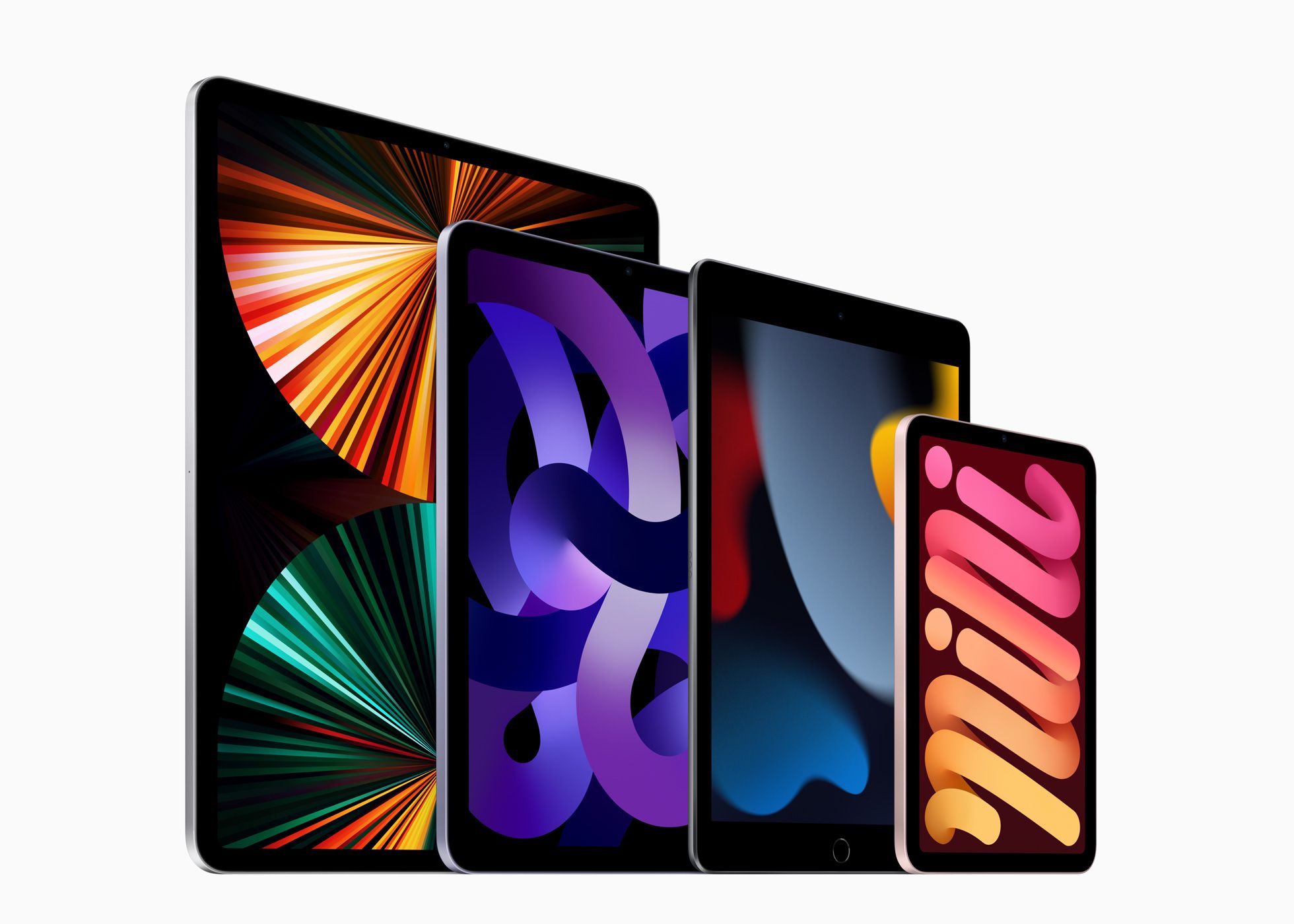 iPad family photo (via Apple)
First, a comparison of the minis. If the iPad mini is really an iPad Air mini, then the iPhone mini is, truly, the iPhone mini. That is, the both of the minis exist as “little siblings” to their non-pro counterparts in their respective “family photos”. Ok, then: so far, so similar. But whereas the iPad mini changed roles in the product lineup from cheapest (and smallest) to smallest (and weirdest), the iPhone mini has felt shoehorned into the iPhone lineup as cheapest (and smallest) without much more purpose.
A Jobsian 2x2 Grid for Apple’s Mobile Product Lineup
| · | Consumer | Professional |
|---|---|---|
| Tablet | iPad Air & iPad mini | iPad Pro 11” & iPad Pro 12.9” |
| Phone | iPhone & iPhone mini | iPhone Pro & iPhone Pro Max |
I’ve already made the argument that the iPad mini is really more of a pro product, despite its place in the “consumer” box. There is something about a small device that helps it fit into the crevices of a workflow that larger devices just feel too heavyweight to carry out. Pros like weird things – they’re fiddly about the tools they use because they’re using them to fulfill a specific role in their life. They’re even willing to pay a premium to get a device that fulfills that role. And small screens are great for specificity.
So here’s my plea: sure, Apple, kill the mini for now. But for the sake of the pros out there, bring it back with a vengeance: give it a ProMotion display, give it the pro iPhone’s camera array, and for the love of god, give it a bigger battery. It’s ok if the mini’s a little weird: that should be why it exists in the first place.
Long live the Adonit Jot!↩︎
Where we were doing our best to make a feature-length film, one hour-long class period at a time, throughout a semester.↩︎
By the way, no — the mini hadn’t served the role of “most affordable iPad” for a long time: since 2017, when the “baseline” iPad came back with a $329 price tag, to be exact.↩︎
When Scott Forstall was fired from Apple in late October 2012, John Gruber remarked on Apple’s straightforward communication style:
One of the things I admire about Apple is their plainspokenness, both in advertising and in press releases. […] At first glance, the headline of the press release announcing Forstall’s departure seemed to go against this: “Apple Announces Changes to Increase Collaboration Across Hardware, Software & Services”. That was followed by a subhead: “Jony Ive, Bob Mansfield, Eddy Cue and Craig Federighi Add Responsibilities to Their Roles”.
Thinking about it some more, though, and considering what I know about Forstall’s reputation within the company, I think that headline, euphemistic though it is, tells the plain truth: Forstall was an obstacle to collaboration within the company.
Later that week, on Hypercritical 92, John Siracusa noted:
Cook’s record so far: he hired the wrong guy for retail and had to fire him, and he did not manage his current crop of executives — who he apparently loves — well enough because, you know, they bailed on him!
Alright, so here, finally, I think with this reshuffle announcement is the beginning of the real Tim Cook era.
The passing of WWDC22 marks nearly 11 years of Cook at the helm of Apple and nearly 10 years of the “Tim Cook Era” — both longer than Jobs’ first stretch at Apple from 1976-1985 (9 years), and just under Jobs’ second stretch at Apple from 1997-2011 (14 years). With a decade of the Tim Cook Era approaching, let’s take a look at Tim’s tenure thus far.
Gruber has long argued that filmmaking is an apt metaphor for any collaborative creative endeavor, including Apple’s approach to business. Through this lens, Steve Jobs was the Apple auteur — the man with both the vision and the taste that earned him the privilege of final cut over the products the company shipped.
As such, the central questions I ask of a retrospective on the Tim Cook Era are: Is Tim Cook the new Apple auteur? And does he need to be?
It would be both impossible and foolish of me to attempt to encapsulate the nuances of a hotly debated form of film critique in a piece ostensibly about Apple, but a brief overview of auteur theory is in order. Simply put, auteur theory claims that a director’s taste can have the greatest influence over the final product of a film; that the director is like the author of a film.
Gruber offers a corollary to this claim: authority is a sine qua non for auteurs1. (Without final cut, how can a director claim the greatest influence over a film?) What follows is Gruber’s thesis about auteur theory, in general:
The quality of any collaborative creative endeavor tends to approach the level of taste of whoever
is in chargehas final cut.
We will adopt this framework in an assessment of the Tim Cook Era.
In short, a great auteur2:
Steve Jobs was, unquestionably, a great auteur:
It’s not revolutionary for me to say that the quality and success of Apple itself was largely the result of Jobs’ vision for the future of computing: Apple was successful because they had incredible products, and Apple had incredible products because Jobs had the authority and the taste to make them great. We experience Steve’s taste in the Macintosh, the iMac, the iPod, the iPhone, and the iPad, but what do we experience as a result of the Tim Cook Era?
Steve shaped Apple’s corporate structure around the fact that he was a product person: by placing himself at the center of the company, every decision about Apple products ultimately flowed through him. This is the essence of Jobs as an auteur. But when Apple had to get serious about a succession plan, Cook — in this way, the opposite of Jobs — was the only viable option.
From Tripp Mickle’s goldmine of a book, After Steve:
There wasn’t a true challenger. Three of Apple’s most talented engineers, software developer Avie Tevanian and hardware executives Jon Rubinstein and Tony Fadell, had already left the company. Rising software star Scott Forstall was considered too young, hardware leader Bob Mansfield was regarded as too narrowly focused, and product marketer Phil Schiller was thought of as too divisive. Jony Ive was better at managing a small team than worrying about Apple’s sprawling business. Retail chief Ron Johnson had the marketing and operational skills required but hadn’t been exposed to many other areas of Apple’s business. “He didn’t have a choice,” said one of Jobs’s former advisers. “No one else could have taken that job. At least fifty percent of Apple’s value was the supply chain.” […] The selection surprised some outsiders because — as Jobs told his biographer, Walter Isaacson — Cook wasn’t a “product person.”
In other words, Cook is a great leader but isn’t a product visionary. If Jobs structured Apple to keep a product person at its center and grant them final cut, Cook’s Apple would suddenly supplant the creative mastermind at the center of the org chart with an operational mastermind, pulling the beating heart out from the center of the company structure and replacing it with something more akin to the brain.
When Tim took over, Steve had a characteristic quip (emphasis mine):
Jobs said he had studied what had happened at the Walt Disney Company and how it had been paralyzed after its cofounder Walt Disney had died. Everyone had asked: What would Walt do? What decision would he make?
“Never do that,” Jobs said. “Just do what’s right.” — Tripp Mickle, After Steve
Cryptic, curt, and concise (yet consistent), Steve’s message to Tim was both discerning and well-received: Tim knew he wasn’t a product person, a reality that burdened him with the task of remaking Apple in his operational image, the same way Steve had done in his creative one. To avoid treading water, á la Disney, the Tim Cook Era would have to be characterized by an Apple where the CEO was no longer the product auteur. Instead, Cook delegated creativity to the creatives while steadying Apple at an inflection point in the company’s growth: Cook’s first move was, in many ways, preordained by circumstance. Before he could fit Apple around the brain (and avoid losing the heart), his first job as CEO was to keep the successes of Steve’s Apple — at the top of its game – humming along. Only then could he truly shed the dogma.
From Asymco’s Horace Dediu in “Wherefore art thou Macintosh?” (annotation mine): 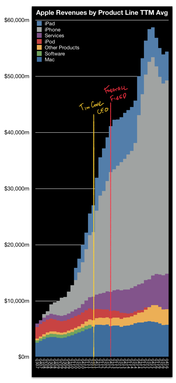
I’ll let you be the judge of whether Cook’s management was successful in the interim period between taking the reins and the start of the Tim Cook Era.
So, is Tim Cook the new Apple auteur? An unsurprising conclusion: no. Steve knew it. Tim knows it. Hell, we all knew it, long before the Tim Cook Era began. Cook is not an auteur, but that doesn’t mean that Cook is a bad CEO, that Apple is doomed, or even that Apple has lost its soul. After all, not every creative enterprise is the same.
Diving deeper: as part of restructuring Apple, Cook has continually made decisions outside the realm of the final product. He’s brought operations closer to the center of the concentric circles that make up Apple’s corporate structure – all to ensure the now colossal company can continue to create, as Cook would say, “great products”.
So, if Cook is putting people in the right places to keep launching great products, what does that make him in Gruber’s conception of Apple as film production? My conjecture: Tim Cook is Apple’s executive producer.
Great films can be the singular product of a visionary auteur…but not every great film has to be. At the very least, successful films can be more the product of a studio than of a director.
| Movie | Worldwide Gross (in 2020 $) | Year |
|---|---|---|
| Gone with the Wind | $3,724,000,000 | 1939 |
| Avatar | $3,273,000,000 | 2009 |
| Titanic | $3,096,000,000 | 1997 |
| Star Wars | $3,059,000,000 | 1977 |
| Avengers: Endgame | $2,811,000,000 | 2019 |
| The Sound of Music | $2,562,000,000 | 1965 |
| E.T. the Extra-Terrestrial | $2,501,000,000 | 1982 |
| The Ten Commandments | $2,368,000,000 | 1956 |
| Doctor Zhivago | $2,244,000,000 | 1965 |
| Star Wars: The Force Awakens | $2,213,000,000 | 2015 |
[Highest-grossing films adjusted for inflation (via Wikipedia)]
In the list of the highest-grossing films of all time, there are various levels of auteur cinema, from the completely corporate, sickly saccharine, assembly-line candy in Avengers: Endgame to something certainly more auteur, like the original Star Wars. (In our framework, who has exercised more authority over final cut than George Lucas?) By nature of these movies being among the highest-grossing films of all time, they are definitionally successful. Are they great art? Some certainly are, but only you can make that judgement, depending on how expansive your definition of “art” is.
Now, at the top of the list, since 1939, lies what could be considered the ultimate example of a successful film that was the product of a producer, instead of a director. Gone with the Wind was both a commercial success and a critical darling, winning eight3 Academy Awards (including Best Picture) and becoming the highest-grossing film of all time. It is widely considered one of the greatest films ever made. Victor Fleming directed the film, but he was not the only director involved: Selznick fired original director George Cukor and replaced him with Fleming, who was then replaced by Sam Wood for a brief period when Fleming fell ill. The point is that this film was a massive undertaking by a studio that had multiple cooks in the kitchen – all ultimately deferent to Selznick, the producer.
A successful film does not necessarily have to be the product of a single visionary auteur. A studio can produce a popular film, so long as all the pieces come together in the right way.
Tim Cook is Selznick, not Hitchcock. After all, who is better at bringing pieces together than Tim Cook?
Certainly, putting the pieces together is an art of its own. Remember how “at least fifty percent of Apple’s value was the supply chain”? If you don’t consider Cook’s work, at the very least, impressive, then this essay is probably not for you.4 But if you’re with me here, I hope my conjecture can now be taken as an assertion: Tim Cook is Apple’s producer.
As such, here’s the bottom line: At this point in Apple’s maturity, it needs a producer as its CEO because producers are the only ones that can enable the auteurs to achieve the scale5 of success Apple’s products will need in the future. Apple’s not the scrappy kid it used to be.
Selznick, Gone with the Wind’s producer, is among the most successful movers and shakers in Hollywood history, but that doesn’t mean that he was an artist, or that his movies were necessarily great art. Industrialized film production is such a rich metaphor for Apple’s work because both are businesses that work to create successful and artistic products. Gone with the Wind was a hugely successful product. There was artistry in creating it. But, again, it isn’t necessarily great art:
You will leave it, not with the feeling you have undergone a profound emotional experience, but with the warm and grateful remembrance of an interesting story beautifully told. Is it the greatest motion picture ever made? Probably not, although it is the greatest motion mural we have seen and the most ambitious film-making venture in Hollywood’s spectacular history. — Frank Nugent, NYT Review of Gone with the Wind
Herein lies the problem with great production alone: it can compose great artistry, but it rarely results in great art. As Gruber put it in his talk about auteur theory, sometimes the whole is less than the sum of its parts. A producer’s work is to get the parts in place; an auteur’s work is to assemble the parts into something more. A great auteur that can transform a smattering of pieces into a whole, whose gestalt brings an intangible meta-art into being. This is not to imply that great producers cannot make beautiful things, or that great producers cannot make successful things; rather, a great producer consistently embarks on ambitious things and makes them happen. Whether they are great art or not depends on something beyond the producer’s direct control. It often depends on the auteur they place at the center of the creative endeavor.
Great producers take on ambitious projects, so let’s fully size up Tim Cook. If the ultimate expression of auteur Apple was the Mac, iMac, iPod, iPhone, and iPad — all products that centered the art of Apple — then the ultimate expression of producer Apple has been, and will continue to be, the products that centered the ambition of Apple6:
I’d call that ambitious.
One year and twenty-four days passed between Steve’s death and Forstall’s ousting, where both Gruber’s and Siracusa’s words rang utterly true: Apple’s press release marked the beginning of the Tim Cook Era because it announced the removal of Forstall and the end of the Jobs 2.0 Era.
But focusing on Forstall can be followed to a fault. The other side of the coin, which Gruber highlighted, was that Cook cut Forstall to serve a larger purpose: to “increase collaboration” (emphasis mine):
Insiders understood the choice [to make Cook CEO]. Cook ran a division devoid of drama and focused on collaboration. Apple needed a new operating style after losing someone irreplaceable. — Tripp Mickle, After Steve
This, I argue, is Cook’s most consistent and distinctive message as a leader at Apple, and I think it is what will define his time as Apple’s CEO. For example, in 2009, even before he was CEO, Cook gave an impassioned speech to Wall Street analysts, which would be dubbed “The Cook Doctrine”:
There is extraordinary breadth and depth and tenure among the Apple executive team. We believe that we are on the face of the earth to make great products and that’s not changing. We are constantly focusing on innovating. We believe in the simple, not the complex. We believe that we need to own and control the primary technologies behind the products that we make, and participate only in markets where we can make a significant contribution. We believe in saying no to thousands of projects so that we can really focus on the few that are truly important and meaningful to us. We believe in deep collaboration and cross-pollination of our groups which allows us to innovate in a way that others cannot. We have the self-honesty to admit when we’re wrong and the courage to change. And I think regardless of who is in what job those values are so embedded in this company that Apple will do extremely well.
The Cook Doctrine outlines the broad lessons Apple has learned, from a focus on “great products” to “control [of] the primary technologies” critical to those products. But it also outlines the lessons Tim Cook has learned, including the importance of “deep collaboration and cross-pollination” among the talented groups at Apple.7
Even Jony Ive’s departure tracks the collaboration narrative. When he was promoted to Chief Design Officer in 2015, he was burned out from playing Jobs’ role in product development — the auteur — for the Apple Watch, and wanted to leave the company:
Compounding his frustration about it all was a feeling that he had shouldered many of those responsibilities alone. Jobs had visited the studio almost daily and supported the designers’ work, giving them direction and urging them onward. Cook, on the other hand, seldom came by, and when he did, it was only briefly.
In a few years, Ive had gone from being Jobs’s favored disciple to being one of many leaders in Cook’s egalitarian world. He decided that he wanted out. — Tripp Mickle, After Steve
More on Ive’s decision, as a product of Cook’s collaborative world:
Ive stood before them, brooding and distant. Ive could feel his creative spirit dimming. Behind the scenes, he had spent much of the past three years engaged in corporate conflict. He had tussled over whether to develop a watch with former software chief Scott Forstall. He had then battled over which of its features to promote with chief marketer Phil Schiller. Concurrently, he had confronted rising concerns about costs as he selected construction materials for Apple Park. And he had been sapped by the additional responsibility of managing dozens of software designers. He navigated it all without the support and collaboration of Jobs, the creative partner whom he hadn’t fully mourned. The entirety of it left him feeling exhausted and lonely. — Tripp Mickle, After Steve
Cook’s insistence on Ive interfacing outside his insular industrial design team — his insistence on collaborating consistently — was enough to push Ive out of the company. Even when Cook feared that he would be seen as the CEO who let the best industrial designer in the world go, collaboration won. First Forstall, then Ive. Those who won’t collaborate won’t survive in Cook’s Apple.
If collaboration is so important to the Tim Cook Era that it’s forced two of Jobs’ closest thought partners out of the company, has it been worth it? Lest we downplay Cook’s track record, it’s time to observe the results of a collaborative Apple.
Here are the Apple products that have been released in the Tim Cook Era thus far:
This list is reductive to emphasize a point: Cook has skillfully scaled Apple on the back of Jobs’ visionary products, but hasn’t successfully had his iPhone moment. In fact, Cook’s resumé reveals just how integral the iPhone is to Apple: services are mostly an iPhone accessory, as are the Apple Watch and AirPods. Moreover, AirPods were a direct result of Ive’s work on the watch, and the watch was supposed to liberate us from our phones, something that seems exceedingly unlikely.
Perhaps it’s unfair to measure against the iPhone, but if Apple’s goal is to be as successful at industry disruption as it’s been in the past, why would we use any other measuring stick? If collaboration is leading to better financial results while product innovation lags, shouldn’t that be a concern for Apple? Apple was “the Mac company” as a result of the Jobs 1.0 era, “the iPod (and Mac) company” at the beginning of the Jobs 2.0 era, and “the iPhone company” by the end of the Jobs 2.0 era. Here’s the thing: ten years into the Tim Cook era, Apple is still the iPhone company. In many ways, Cook has only solidified that fact: in Horace Dediu’s 2007-2016 revenue chart, the iPhone literally(!) buries the Mac, kills the iPod, and pumps up Apple’s services revenue, all trends that have continued under Cook’s leadership.
The generous read, in this case, is that Apple has no reason to disrupt the iPhone…it’s incomprehensibly successful! On this point, agreed: a lack of disruption would seamlessly track with Cook’s focus on collaboration. The problem is, historically, Apple’s heads-down attitude toward innovation is what placed them at the forefront of the industry. Disruption — including self-disruption — is a proven playbook. Apple isn’t afraid to kill its own products if consumers are buying another Apple product in its place.
As far as collaboration goes: so far, so bad.8
In some ways, Cook’s focus on collaboration has been at the expense of Apple’s ability to release products with an auteur quality. But as I noted before, to look only at the surface level of the products Apple has released so far is to be reductive. The whole point of this investigation has been that Cook is a different kind of leader than Jobs was, something that was ordained by Jobs himself. As our investigation winds down, we’ll finally look under the covers and determine just how deep Cook’s unique style runs, and what that means for the future of Apple’s products.
We’ll first address the points made before about Tim Cook Era products:
Collaboration alone, then, has had a mixed track record; I would call it a wash after our analysis. But what can we make of Cook’s ambition, as a producer, when we see them through the lens of collaboration, a Cook Doctrine tenet?
We’ll begin with a new approach to our previous critiques of the Apple Watch, AirPods, and Apple’s services.
Let’s start easy. Apple’s services sit atop all of their devices. They are, ipso facto, collaborative efforts, albeit in a mostly uninteresting way. Regardless, Cook’s signature hobbyhorse — and the thing that the Conventional Wisdom seems to parrot as the most important thing to come out of Apple in the Tim Cook Era — is undeniably collaborative.9
First and foremost, the Apple Watch and AirPods were a product of a more auteur-focused Apple. They were ultimately Jony Ive’s babies and a product of Ive’s attempts at maintaining the insularity of his design team. Even on its face, then, these products should be taken with a grain of salt when viewed through the lens of a collaborative Apple – there were countervailing forces at work during a tumultuous time of transition. Insularity vs. collaboration; Forstall vs. Cook; Ive vs. Cook.
But we can even see Cook’s mark of collaboration in the Apple Watch and AirPods and in Ive’s work on them:
During the product’s development, Ive had played the role of Jobs and himself, overseeing industrial and software design, as well as directing marketing. The work had pulled him out of the design studio and into more and more meetings. The influence he had once sought over all aspects of a product’s development had burdened him with endless obligations and stress that took a physical toll. He fretted that he’d missed time with his eleven-year-old boys. He grew sick and caught pneumonia. — Tripp Mickle, After Steve
Despite the tragedy that these circumstances took a physical toll on Ive, these facts contain key evidence that even the watch (and, by extension, AirPods) – Apple’s most auteur product in the Tim Cook Era – was still a deeply collaborative effort. We see the results of this in the fact that the Watch (and AirPods) is (are) heavily intertwined with Apple’s Continuity features (and auto-switching). We’ll come back to these features in a moment, but we can minimally state that there is undoubtedly a collaborative mark on the watch (and AirPods).
Even these products – ones that we have, thus far, deemed a mixed bag in terms of legacy at Apple — bear the mark of the Cook Doctrine. Where else do we see that influence?
Continuity, aforementioned, might be one of the most overlooked results of increased collaboration. That is, Continuity has increased collaboration…between the Apple devices we own. Of course, I’m being cheeky here; increasing “collaboration” between our devices must mean there is deep collaboration between teams at Apple.
Apple devices’ ability to work together (mostly) seamlessly is something I often see taken for granted. It’s easy to take things for granted that are seamless in a subtle way, even when their execution is more akin to a magic trick. But seamless interplay between devices is something that’s far from a given when it comes to computing.
The bottom line here is that I don’t know if Continuity would have been as much of a priority in Jobs’ Apple, especially if Forstall (famously fired for his iOS fiefdom) and Ive (his insular industrial design team infamous for ignoring usability) were still at the company. Continuity is undeniably Cook.
And now, to really drive the point home: Apple silicon. It should be unsurprising that the core of Cook’s efforts have been in getting the right pieces in place — that’s the role of the producer, after all. I think it goes without saying that Apple silicon’s rollout is one of the most impressive executions of an enormous technological leap forward in the last decade, and that Apple silicon now sits at the center of all of Apple’s major efforts, from hardware to software to services. Apple silicon — the brain of Apple’s devices — is what literally runs the company’s products. Can’t get much more collaborative than that.
In a way, Cook’s influence, much like the man himself, is understated. It sits below the surface of many of Apple’s endeavors. His collaborative core has created an environment where the distinctions between Apple’s products have continued to soften: services sit on top of Apple’s platform, for example, while Continuity blurs the lines between them. Apple silicon sits at the center of the shift, powering the future of the company along with its devices.
If Cook’s resumé stopped there, I think any reasonable person would say that he was an extremely successful CEO. He’s steadied the ship. He’s left his mark. He’s avoided stagnation. In the end, it may have been foolish to embark on a full retrospective of the Tim Cook Era — it may just be too early to make a great judgement – but I think we are on the precipice of Cook’s chance for his iPhone moment. In fact, Tim Cook has one more thing — a final major product category he’s gunning to launch. Essentially everyone agrees that it’s going to be Apple’s mixed-reality headset, a huge initiative that I think we can now say will be the true test of the Tim Cook Era, and thus of a producer’s ability to run Apple.
When Jobs introduced the iPhone, he performed a little magic trick: Apple would take three separate products and make them into one (“are you getting it?”). It was no accident, either. The best presentations, like the best films, pull one over on the audience with a little deception, a little vision, and a lot of hard work and skill. A great auteur works their sleight of hand to weave a narrative so compelling that it moves you. A great producer pulls together artists in the name of making something so great that you won’t even realize how enormous the undertaking was. Apple’s best products, exemplified by the iPhone, are the same way. They just work. They make you think different. They’re magical. I suppose that, after all this, I’m just excited for what Tim Cook’s got up his sleeve.
Fun fact: author, authority, and auteur all share a common latin root.↩︎
As I noted before, auteur theory itself, as a method of film critique, is mired in controversy, is generally ill-defined, and (in my evaluation) lacks focus on what it aims to accomplish. When Andrew Sarris appropriated the French term “auteur” in 1962, he came the closest to crystallizing a definition, which includes three criteria for a successful auteur: (1) Technical competence, (2) Style, and (3) Interior meaning. Our framework, for the purposes of this essay, builds more on Gruber’s analysis of auteur theory (which I find more sensible, by the way), but does align with Sarris’ read on auteur theory as well, especially with “technical competence” and “style”.↩︎
Plus two honorary awards, for a total of ten.↩︎
Again, from After Steve: “Word spread through the company that Cook wanted its next major device to deliver at least $10 billion in sales, an artificial benchmark to ensure that any project Apple pursued would be more than a rounding error for a company now reporting $170 billion in annual revenue.” If you have derived any value from this essay, you really need to read this book!↩︎
A note here, for transparency: I have no idea how to accurately find market sizes…I did my best, but the bracketed estimates of market sizes are mostly the result of me doing some quick Googling.↩︎
As an aside, it’s also worth noting that Cook clearly believed in having “self-honesty to admit when [Apple was] wrong,” something Forstall struggled with. When the Apple Maps launched as a dud, Cook asked Forstall to sign an apology to customers, and guess who didn’t sign.↩︎
You could nitpick with me over the fact that Tim Cook’s leadership has taken Jobs’ products and made Apple the most successful company in the world, but the point I’m making here is that Apple is looking for its next product. If Apple was still “the Mac company,” it wouldn’t have the privilege of being “the iPhone company!”↩︎
It’s fun to note here that Cook is, for all intents and purposes, a literal studio executive with a Best Picture Oscar and Outstanding Comedy Emmy now.↩︎
View the archives