Steve Jobs always kind of hated the Finder. In fact, in his last keynote ever, he took a characteristic beat to pick apart the thing he considered his son: “a lot of us have been working for ten years to get rid of the file system”, he said. “When you try to teach somebody how to use a Mac, the easiest of all computers to use, everything’s going fine until you hit the file system!” His critique of the Finder – the face of the Mac — marked the end of his decades-long voyage with turbulent ideas about what a graphical user interface could – and should — be.
Harbingers (Part 1)
or: how i stopped worrying and learned to love the name
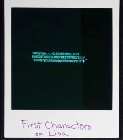
If Jobs’ voyage with the GUI ended in 2011, his file system odyssey began in 1979. In what has been called computing’s “Prometheus myth”, Jobs visited Xerox PARC with a small team from Apple, where they received a demo of Smalltalk running on an experimental computer called the “Alto”. There, Jobs saw the graphical user interface working on a personal1 computer for the very first time. “Within ten minutes”, he would recall, “it was obvious to [him] that all computers would work like this”.
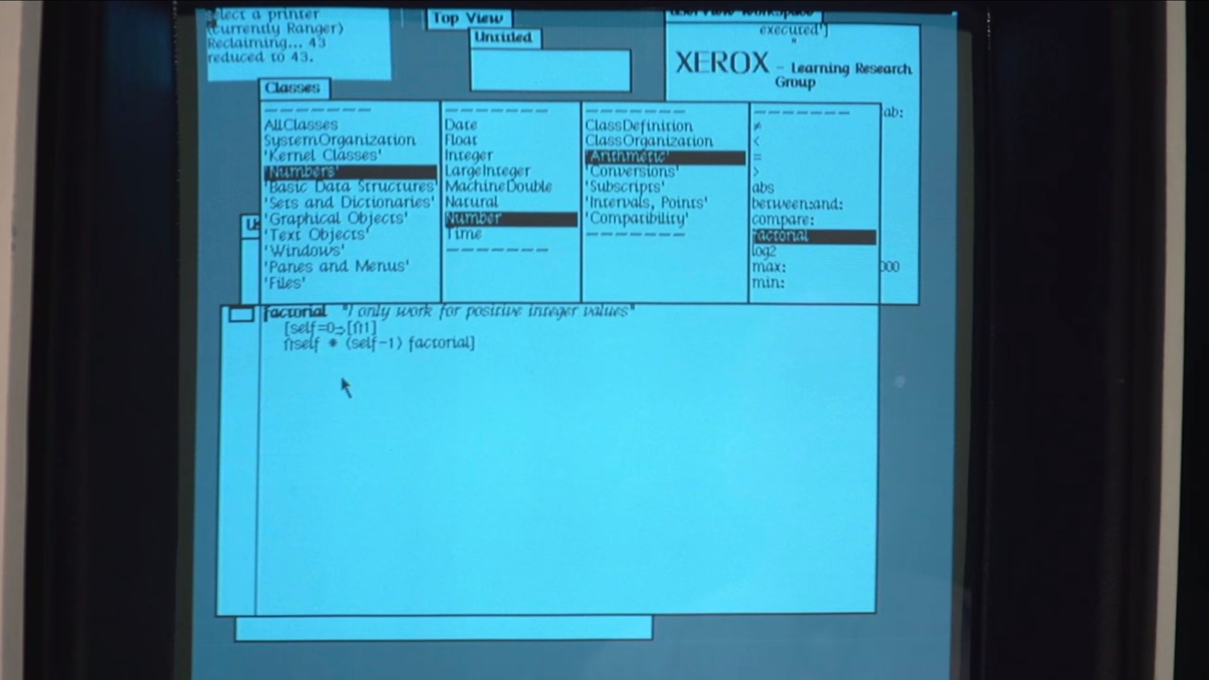
Smalltalk running on the Xerox Alto.
As the story goes, the team would then steal the graphical user interface from PARC, run with it, and turn it into the Mac. They’d stolen the GUI from the gods and given it to the people.
But as with any great myth, the version that gets told is much cuter than what actually happened. And as with anything that…actually happened…the storylines of Xerox PARC, Steve Jobs, and the Mac weave and wander their way into a tapestry that is more fascinating than any cute myth can capture. You see, the truth of the story lies in the fact that the GUI’s debut was not on the Mac, but the Lisa. And the story goes even further back: at the start of the project, the Lisa was not a machine with a GUI, but was one with a command line.
Part 1: Prometheus in Dataland
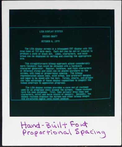
When the Lisa project began in 1978, it was going to be a successor to the Apple II. It was aimed squarely at professionals who needed a word processor. So, when the Lisa team entered PARC in late 1979, the machine was supposed to be just that: a command-line computer with green text staring back at you, beckoning ominously for a command.
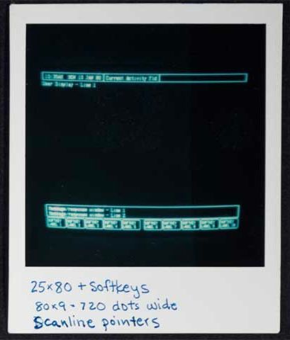
The Lisa’s command-line interface, featuring a menu of “soft keys”, before the Lisa team’s visit to PARC.
The Lisa team’s goal was to have the computer make accomodations for the “average” user, who would just want to process text and almost certainly wouldn’t want to memorize commands. Before PARC, they’d do this by listing the commands on the bottom of the screen in a menu of options to choose from, allowing the user to select commands using special function keys on their keyboard. By the time the Lisa team left PARC, though, the computer was set to become something else entirely.
After the visit, Bill Atkinson swiftly led the charge to create a user interface featuring windows, icons, menus, and pointers inspired by the team’s goal to make the Lisa accessible, and of course, by they work they’d seen at PARC. As he began, the Lisa spec was rewritten and the first iterations of Apple’s graphical user interface began looking a lot like the demo they’d seen on the Alto.
The rest of 1980 featured rapid iteration on the core ideas they’d seen in Smalltalk. Mouse-based text editing, non-modal commands, scroll bars, title bars, clipboards, I-beam cursors, moveable and minimized windows, double click, and pull-down menus were all present by the end of the year. At this point, the GUI really did resemble a more refined version of Smalltalk.
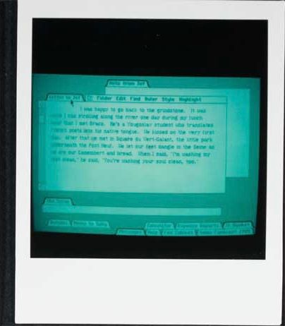
An editor window on Smalltalk, showing scrollbars, multiple windows, the class browser, etc.

An editor window on an early Lisa GUI, showing multiple windows “docked”, pull-down menus, etc.
But just as the Lisa was getting some wind in its sails, Jobs was forced to walk the plank. Forced off the team, he began to hunt for new projects to latch on to throughout the company. After seeing a prototype Mac, he decided to jump aboard. At this point, the Mac team had quietly been plugging away at their skunkworks project for a couple years under the leadership of “Uncle” Jef Raskin. But the details were still pretty fuzzy by the end of ’80. While the Lisa team had already finalized their direction and approach by the start of 1981, the Mac’s direction, under the leadership of Jobs, was about to change drastically.
It’s safe to say that Jobs, with his distinguishing mix of passion and vengeance, was ready to exact revenge on the Lisa and his former team. The Lisa project is where Jobs had fallen in love with the GUI, and after being separated from his baby, it became his goal to turn the Mac project into a computer that would compete with the Lisa to bring the GUI to the people.
In many regards, this goal made the Mac team the perfect place for Jobs to land. Uncle Raskin’s original vision for the Mac was an “easy to use, low cost, high volume appliance” computer. But eventually, as Jobs took a more and more central role on the team, Raskin began to push back: he “was dead set against the mouse…preferring dedicated meta-keys to do the pointing. He became increasingly alienated from the team”, eventually resulting in Jobs leading a mutiny on the project so that he could take the helm. With Raskin out, Jobs took control of the skunkworks Mac group.
Throughout ’81, the Lisa continued to calcify. Key applications were being written on the GUI that, by now, had a solid foundation. Back on the Mac, work had begun on its iconic industrial design, and the graphics foundations of the device were finally being written. By the middle of the year, collaboration between the Mac and Lisa groups was steady. The Lisa’s UI really solidified, which the Mac group continued to draw from, while Atkinson’s fundamental Lisa graphics component, QuickDraw, was ported to the Mac. At this point, the Mac was starting to get recognized as a real project throughout the company: it was thought of as a “Lisa that was priced like an Apple II”.
Confluence of Influence
It’s at this point that I want to tell you why I’m recounting this story. Many others have told it before. But what’s often left implicit is what the Lisa team didn’t see at PARC. Yes, Smalltalk was decades ahead of its time. Yes, it single-handedly spearheaded massively influential technologies that are still prominent to this day. But Smalltalk didn’t have a file manager.
Remember, the GUI began on the Lisa and the Lisa began as a word processor. Its aim at the office meant that it was going to be made to do office things, namely create and manage documents. (What’s more office-y than managing documents‽) So, at the start of ’82, the Lisa’s file manager – called “the Filer” — became an important point of frustration for the Lisa team.
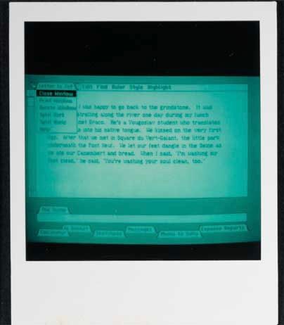
Dan Smith and Frank Ludolph were working on the Lisa Filer, the key application that managed files and launched other applications. It was beginning to come together, but Dan was still unsatisfied with the current design.
The Filer was based on a dialog window that prompted the user to select a document from a list, and then select an action like “Open”, “Copy” or “Discard”, and then answer more questions, depending on the selected action. There was so much prompting that it became known as the “Twenty Questions Filer”. Dan thought that it wasn’t easy or enjoyable to use, but there just wasn’t enough time left in the schedule for further experimentation, so they were pretty much stuck with it. — Andy Hertzfeld, Rosing’s Rascals
The Twenty Questions Filer.
The idea of a simple, filter- and directory-based filing system was drawn from what the team had seen at PARC. It’s what was normal at the time, being directly analagous to the file management practices that pervaded text-based interfaces throughout most of the prior history of computing. Put simply, you’d work to find the file you wanted by moving through lists of files and directories, forcing the user to abstractly visualize entire trees of information that might exist on their computer. So, while the Twenty Questions Filer wasn’t great, it was par for the course and it would have to do.
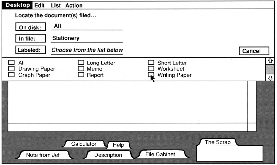
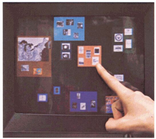
The Mac team was also experimenting with file managers at the time. Bruce Horn had recently joined the Mac team — from Xerox PARC, in fact – and was working with Andy Hertzfeld on the Mac’s version of the Filer, in this case dubbed “the Finder”. By February 1982, Horn and Hertzfeld had thrown together what they called the “Micro-Finder”.

The Micro-Finder.
Bruce came up with the idea of representing files as small tabs superimposed on an image of a floppy disk. He wrote a prototype that he called “the micro-finder”, which is pictured above. I started helping him implement various parts of it, and pretty soon it was actually useful. You could drag the file tabs to position them, and click on the large buttons on the right to launch programs or rename and delete files. — Andy Hertzfeld, Busy Being Born, Part 2
While it looked nothing like what the Finder would become, it did bring several innovations to a truly graphical file manager: instead of requiring the user to visualize abstract directory “trees”, it allowed them to see files, go to them, and move them around the screen with drag-and-drop.
Back on the Lisa team, Dan Smith couldn’t take the Twenty Questions Filer anymore. He brought his woes to Atkinson, who “suggested that they meet that evening at his home in Los Gatos for a brain-storming session to see if they could come up with a better design, even though it was probably too late to use it for the initial release.” Atkinson had recently seen the Micro-Finder, along with a second version that used icons, which the Los Gatos crew used as a starting point to discuss a new direction for the Filer. He also took inspiration from “an interesting prototype that he saw at M.I.T. called Dataland, where data objects could be spatially positioned over a large area.”
Dataland
Dataland was the result of work from MIT’s Speech Interface Group, funded by DARPA. It was a research effort framed through the combination of two distinct lenses:
First, the group aimed to create a computer interface that used a “memory palace” to augment human performance and recall. Also known as the “Simonides Effect”, the technique asks an individual to take whatever is being memorized and visualize it in a familiar location — exploiting humanity’s evolved ability to recall information spatially — to enhance their memory. It has historically been used to recall things like speeches or poetry.
Second, they hoped to create a semi-infinite virtual world “open to user definition in the unconstrained sense of Ivan Sutherland’s characterization of a computer display as ‘a window on Alice’s Wonderland’”. In other words, they hoped to acknowledge that the physically limited size of a computer’s display does not necessarily limit the implied size of content being displayed; unlike a physical page, a computer display is a magical and flexible window into the world of content inside the computer.
Combining these spatial concepts resulted in the “spatial data-management system” (SDMS), whose goal was to help a user “[access] a data item by going to where it is rather than referencing it by name” (emphasis mine). This approach was directly opposed to the common practice of asking users to fetch documents by name, which required abstract visualization of file “paths” and directory “hierarchies.”
“It is precisely the insight about how we tend to retrieve items from desk tops, from files and bookshelves, even from erased blackboards, that lies at the heart of the spatial data management concept”, they said, “we find items on the basis of a more or less definite sense of their location in a familiar space, which space may be actually present or remembered. This well-evolved human ability to organize information spatially remains essentially untapped in the realm of computer-based information handling.”
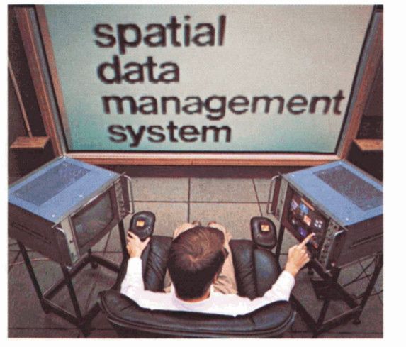
The affordances the Speech Interface Group created in their SDMS toward this end were numerous and, looking back, quite astounding. In their 1979 paper on SDMS, the Speech Interface Group described the details of Dataland in three separate sections, first describing “the setting,” then going on to break down how users “find” data and subsequently “peruse” data.
The setting.
As far as setting goes, a user would sit at the center of multiple screens, some of which were touch-sensitive, and then would “point to data or [would] input gestures indicating actions to be taken” on a graphical user interface.
If your jaw hasn’t hit the floor yet, this was three years before the Apple Xerox PARC visit. It was nineteen hundred and seventy fucking six and they were incorporating an optional “ten-inch-square data tablet, with stylus,” and “a small microphone mounted at its top edge to allow voice input”, all topped off with an “octaphonic sound” system enabling spatial audio (!!!). But we’re getting ahead of ourselves.
A user finding documents in Dataland, using a touch screen “world view”.
To find data, users needed “commodious ‘virtual’ space” as well as “a way of getting around in that space quickly and easily.” The Speech Interface Group’s SDMS was implemented using two distinct views of Dataland: first, a view “continuously visible to the user in its entirety in an ‘aerial,’ top-down view displayed on one of the monitors,” called the “world view monitor”, and second, “simultaneously, a small subsector…displayed on the ten-foot diagonal screen to the user’s front, vastly enlarged and with appreciable gain in detail.”
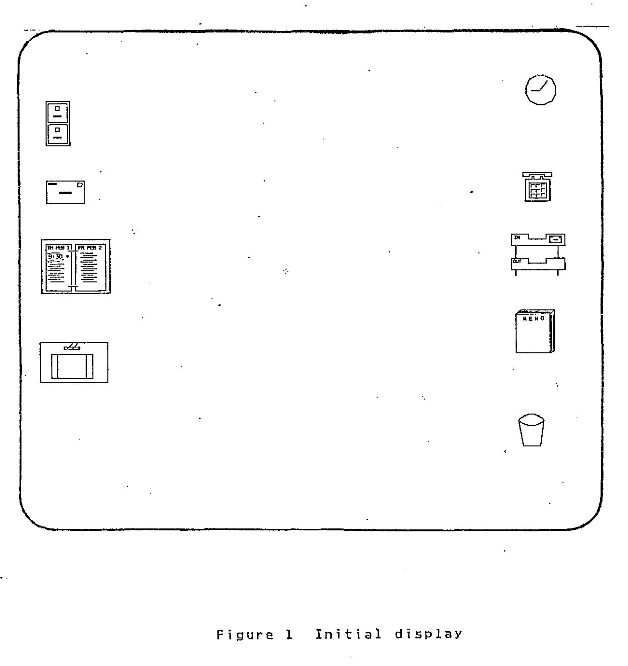
It takes all I’ve got to stop talking about Dataland, but I’ll cut it off here because it’s at this point that we can see its categorical influence on the Filer. Even beyond the use of the SMDS’s philosophical basis, Dataland’s simultaneous world view and magnified view were actually present in the earliest mockups of the Icon Filer, which was a split-pane view with the top pane depicting the “world view” and an “exploded (detail) view” in the bottom one.
From left to right: Dataland’s large-screen “detail view”; Dataland’s smaller touch screen “world view”.
An early Lisa Filer with split view. From bottom to top: the Filer’s pane with a “detail view”; the Filer’s pane with a “world view”.
The split-pane concept was eventually scrapped, but it’s clear that this foundation is what gave birth to the Lisa’s graphical approach to file management. The Filer strictly adhered to what the SDMS achieved by allowing users to, as the Speech Interface Group defined, “[access] a data item by going to where it is”.
At this point, most of the Lisa team’s approach was set — the Filer and Finder had taken lessons from Dataland, and the window manager mimicked features from from Smalltalk. Still, something was missing. Remember, the Lisa was supposed to be a computer aimed at popularizing the GUI by growing the market to include, as Apple PR noted, “more than 30 million americans – and millions more abroad — [who] work in offices. Executives and managers in the accounting, marketing, financial, engineering, and planning professions” were the prime targets of the “computing market of the future” (emphasis mine).
To appeal to this market, the interface needed to be familiar to someone unfamiliar with computers: windows and spatial filing are great, but if you don’t know where to start, you’ll probably never touch a computer again. To achieve this, the Filer team turned to IBM.
Pictureworld
Back in 1980, a year after Dataland, IBM published a paper called “Pictureworld”, describing a system with a graphical user interface aimed achieving many of the same goals that were articulared for the Lisa:
- The Lisa was supposed to “be designed to require extremely minimal user training and ‘hand holding’”, and Pictureworld was oriented toward users who were “less likely to be motivated by the development of supporting skills, such a learning the intricacies of [their] firm’s computing system”.
- The Lisa was supposed to “adhere to the concept of ‘gradual learning’” and Pictureworld was supposed to “minimize the user’s entry cost to the system”.
- The Lisa was supposed to allow “a user to put whatever [they are] doing on ‘hold’ in order to answer the phone, look up an address, or respond to an asynchronous interrupt” and Pictureworld was supposed to allow “for intermittent communication and fact finding, [since the user’s] work is frequently interrupted.”
The list goes on and continues to be remarkably similar. IBM’s solution to satisfy these requirements? Create a user interface that “[provides] much more competence in modeling the users’ task environment and needs than has previously been attempted”. For an office worker, the user’s “task environment” was the office itself.
In using iconic representations of familiar office objects (on its display) as a control interface,” they said, “the Pictureworld concept achieves familiarity, naturalness, self-prompting, and (plausibly) minimal cognitive interference with the primary task.”
The design centered around workflows that an office worker might want to achieve. On startup, Pictureworld would greet users with a diorama of an office setup, complete with a filing cabinet, inbox/outbox, memo pad, desktop, and more.

The user might then open their inbox to review and take incoming documents (from some disk or network) to file them away or to do something with them by placing the documents on their desk, which sat on the side of the screen along with the rest of the office paraphernalia.
From there, the workflow would continue, prompting the user along a series of decisions about what they could do with their documents.
It’s clear that IBM’s envisioned implementation was a far cry from where the Lisa ended up, but the metaphor they suggested was powerful. By leveraging office workers’ existing knowledge of the office (and workflows that happen inside the office), a computer could simulate common office practices by conjuring them up in a graphical interface, thereby reducing the amount of learning necessary for a novice.
In general, a metaphor stands or falls based off of its explanatory power. In designing Lisa, Apple knew it was important to “find a central metaphor that’s so good that everything [aligned] to it. [After that,] design meetings [were] no longer necessary, [the device designed] itself”. “The metaphor,” they thought, ”should be crisp and fun.”
So the Lisa team took the desktop metaphor, combined it with a few other insanely great ideas for user interface, and created the computing paradigm that would reinvent the personal computer for the remainder of the millennia, and, arguably, to this day.
Are You Getting It?
The GUI, spatial data management, and the desktop metaphor were three revolutionary advancements in human-computer interaction. The GUI thrust computers forward by creating an entirely new way computers and humans could talk to each other. Spatial data management leveraged the innate and evolved human ability to organize objects physically. And the desktop metaphor provided people with the scaffolding necessary to get started on a computer.
When the Lisa team combined these ideas with a little bit of polish, they formed something greater than the sum of its parts. They’d created the desktop paradigm by allowing users to directly manipulate the content they saw on their screen, picking up and putting down files to organize them just like you’d do in the real world. Even the simplicity of the single-button mouse lent itself to this physical facsimile: clicking a button and and dragging a mouse is literally grasping an object and moving it somewhere else, a perfect analog to the drag-and-drop nature of the Filer.
Their graphical user interface became the only system at the time to support a desktop metaphor with truly spatial filing2, an innovation that quickly became a cornerstone of Apple’s graphical interface; the Lisa became the computer that “works the way you work”, as an early ad would tout.
Soon after the Los Gatos sprint, Bill Atkinson shared the innovation back to the Mac group, who would immediately adopt the spatial desktop approach for the Finder.
The Lisa went on sale in January 1983 as Apple’s flagship product, with Steve’s Mac team following hot on its heels. Bruce Horn and Steve Capps ended up completing the Mac’s Finder, based on the Lisa’s pioneering interface, just before release in January 1984. With that, the Finder was born. And so was the Mac.
Hello
“Hello. I’m Macintosh.” The computer’s voice vibrated, “it sure is great to get out of that bag.”
“Unaccustomed as I am to speaking, I’d like to share with you a maxim I thought of the first time I met with an IBM mainframe: NEVER TRUST A COMPUTER YOU CAN’T LIFT!”
The crowd erupted.
“Obviously, I can talk, but right now I’d like to sit back and listen. So, it is with considerable pride that I introduce a man who’s been like a father to me… STEVE JOBS.”
You could see the delight beaming in Jobs’ smile as the crowd broke out in pandemonium.
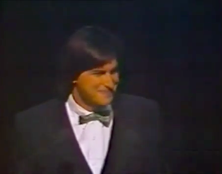
“The uh…” Jobs began as the crowd finally quieted down, “team that developed Macintosh is sitting up here in the first five rows, and they must feel awfully good right now.”
They’d done it. They’d shipped.
Later on in the presentation, Jobs showered the Lisa faint praise: “we introduced Lisa a year ago, and it clearly captured the imagination and set the technical direction of the industry”, he said. After a pause, he continued with a smile: “it didn’t capture as many desks as we wanted to.”
The Lisa had beaten the Mac to market as a GUI-driven computer, but it had come in at a hefty price. The Mac, on the other hand, was going to be priced to be sold in massive quantities.
“The telephone was the first — and only, really — desktop appliance,” Jobs continued, “and we think the Macintosh can become the second desktop appliance for…tens of millions of people. Because of the 235 [million] people in America, only a fraction know how to use a computer! Macintosh is for the rest of us.”
In the effort to make the Mac the second desktop appliance, Jobs laid out three keys components for success. It needed:
- “To do something really useful”;
- “To be really easy to use”; and
- “To be really cheap”.
Just like uncle Raskin had envisioned years before. After all, Jobs had never lost sight of the original vision for the Mac.
To be really cheap was easy: the Apple II was cheap enough to become the first commercial personal computer. It kept Apple afloat for years by being an accessible option for hobbyists and small businesses while they looked for another hit.
To be really useful was harder: the success of the Apple II was driven by the fact that it was a platform for developers, who extended the computer’s function with their software. In 1979, Visicalc (spreadsheet software) became the first ever killer app, expanding the market for Apple II computers from hobbyists to businesses. In short, Visicalc became the first software that was so compelling that it alone sold Apple computers. Nonetheless, in opposition to the Lisa, the Mac tried to capture the spirit of extensibility: it was designed to support third party software, while the Lisa was not.
To be really easy to use was even harder than that: this was the reason that alphabet soup of PARC, MIT, and IBM were combined in Apple’s intensive design process for the Lisa’s, and then the Mac’s, graphical user interface. The solution Apple came to, in a unifying model for the user, was the desktop metaphor as manifest in the Finder, which “would be the ‘face’ of the Macintosh.” Of course, they were successful in that regard: the Finder was “the single most important and influential application in the Mac OS user experience.”
It has been said that “the interface is the computer”, meaning that the average user makes no distinction between the way he interacts with the computer and the reality of the computer’s internal operation. If the interface is hard to use, the computer is hard to use, and so on. The interface is the computer. – John Siracusa, About the Finder…
The Finder was the Mac’s interface, and the Finder was easy to use, so the Mac was easy to use. It’s really as simple as that. The Finder is what made the Mac a success. The Finder is what popularized the GUI.
So there you have it, your little myth all wrapped up in a nice and tidy bow. But I promised you a mess, and if you’ve made it this far, I hope you’re expecting it. Remember, the Finder wasn’t really an innovation from the Mac team. Instead, the spatial desktop metaphor came from the work on the the Lisa, and it fundamentally reflected that heritage. Sure, it was a quantum leap in ease-of-use. Sure, it popularized the GUI. But the Finder’s audience was ultimately the office worker, not the average person. The desktop metaphor centered documents in the user’s workflow — that’s why the Finder was the “face” of the Mac; it was what greeted you every time you turned on your computer. But while a document-centered workflow is great for office workers, who are constantly dealing with documents, it isn’t the ultimate computing-information-communication end-all. Most people, after all, spend very little time tending to their spatial desktop. Your desktop, like mine, might be littered with miscellaneous screenshots and projects and more. Sometimes the mess can really make you feel like a janitor.
How do you like them apples?
You don’t know about real loss ’cause it only occurs when you’ve loved something more than you love yourself.
The party didn’t last long. While the Mac initially became “the first $2,500 impulse item”, selling 50,000 units in 74 days, it failed to live up to the very first of Jobs’ three goals for a desktop appliance: it wasn’t very useful. Despite the Mac team’s efforts to bring developers to the platform, devs just didn’t show up. The team had anticipated that it would be an uphill battle, since the GUI required a completely new programming paradigm for developers, but several other obstacles (including the fact that, at first, you had to use a Lisa to program for a Mac) prevented the next killer app from taking off on the Mac.
So just as the Lisa and her little brother came into the world, their father was forced away: after a strong start, sales began to falter, and Jobs was — infamously — forced out of Apple. Eventually, the Mac found its niche by spearheading the desktop publishing industry, and by 1989, it would sell in the millions, just as Jobs had prophesized. But it was already too late.
To be continued…